Watercooler Wednesday Challenge – WWC72 – Balloons That Shake Rock and Roll to Celebrate

WWC72 – Jean’s In Color Color Challenge

Watercooler Wednesday Challenge Graphic - WWC72 Jean's In Color Color Challenge - new in colors

Welcome to this weeks Watercooler Wednesday Challenge.

Today I’m asking you to play along with Stampin’ Up’s newest batch of In Colors.  A fun set that has a color name that includes my favorite material…Denim!   I’m not sure that denim qualifies as dapper but since the name includes denim…I’ll take it!

Create your own design or CASE (copy and share everything) from the challenge artists or wherever you find your inspiration.  Play with all 5 colors or with the 3 or 4 favorites you have in your studio.  Are you feeling Flirty?  Seeing Sugarplums in your dreams?  Down with Denim?  Whatever your preference grab 3 or 4 (or more) and get down and inky.  On your mark…get set…go!


**********

 Balloon Punch Shaker Card

(as always click the pictures to see larger images)

Watercooler Wednesday Challenge - WWC72 - Jean's In Color Color Challenge - Jean Fitch - Bitty Balloon Punch Shaker Card - Thoughtful Banners Stamp Set

Here’s a close up of the shaker element:


Watercooler Wednesday Challenge - WWC72 - Jean's In Color Color Challenge - shaker detail - Jean Fitch

And the inside of the card.

Only needs a name and a word or two to be good to go.  And gives proof that I used all 5 of the new in colors!

Watercooler Wednesday Challenge - WWC72 - Jean's In Color Color Challenge - Bitty Balloon Punch inside of card - Thoughtful Banners Stamp Set

Can you tell I’m not letting go of the small retired balloon punch?  Yep…it’s just too perfect.   Especially for adding to the shaker bits.  Covers up a few little inky boo boo’s too.  Nope…not saying where they are.  {grin}

Supplies:

Stamps: Thoughtful Banners, Build a Birthday

Inks:  Dapper Denim, Emerald Envy, Flirty Flamingo, Peekaboo Peach, Sweet Sugarplum

Paper: Dapper Denim, Emerald Envy, Flirty Flamingo, Peekaboo Peach, Sweet Sugarplum, Thick Whisper White Cardstocks.   Window Sheets.

Punches: Bitty Balloon from the Party Punch Pack (retired from the 2016 Occasions Catalog)

Tools & Adhesives:  Big Shot, Lots of Layers Framelit Collection,  Metallic Sequins Assortment, Foam Adhesive Strips,  SNAIL.

Technique:  Shaker Card

Cost without envelope: Approx. 40¢

*********

I’ve gotten so addicted to shaker cards lately.  With the new foam adhesive strips they are just so easy.  Now when an idea strikes I can grab the strips and go!  My only limitation?  Keeping enough sequins and window sheets on hand!  Of course if the sequins run out I can use my various punches (especially the confetti stars and hearts punches) to create what I need.

Not sure how a shaker card goes together?  Stampin’ Up has created a video that explains the role of the strips and the basic idea here.   I did a couple of different steps on mine.  I used the Embossing Buddy to take down the stickyness of the sides of the strips (or I would have if I had remembered that step.  LOL) and…I built my shaker on the top of the card base front instead of on the inside of the card.  I feel that makes a neater presentation and adds a bit of height/texture to the card itself.  However you do it…it’s a fun presentation for the recipient.   If you choose the top down approach you’ll add the strips to the back side of your shaped cover/window combo.  Stamp on your card base and pile the shaker bits on top of the stamping and place the window combo piece directly on top.  One other tip…before you add the window sheet piece and strips you can flip the cover piece so the backside is facing up and use that “window” as a mask to stamp your images through without getting ink on the front side.  Easy peasy once you get the hang of it.   I’ll try to put a pictorial tutorial together so you can see the basic steps.   Probably will be a week or two for that since the Watercooler gang has a Blog Hop coming up this Thursday.  Stay tuned for that Hop…it’s shaping up to be a doozy what with all the new product available to play with.  And…there will be another shaker card creation I’ll be sharing during the hop (see the method to my madness with the lateness of the tutorial now?).

*********

That’s it for this challenge.  To see the rest of the design teams In Color Color Challenge contributions head on over to the Challenge blog website here.   That’s also where you can add your own creation with the linky doodad.  When you add your own design and there are more than three entries, one of you will be a challenge winner or runner up and have the option to place our new badges on your own site.  Of course…you’ll also win bragging rights!

Check here to see the winner of last weeks challenge.  And here to see all the other linky and Artist Team entries.  Check the challenge site for rules on competing for future challenges.

I really hope you will add your own creations this week.  Really…this challenge is an easy one.  Grab your colors and play!

I hope you’ll join us next Wednesday for yet another Watercooler Wednesday Challenge.

Jean Fitch in pink


Save

WCC30 – A Cup of Cheer in 3D

  WCC30 Susan’s 3D Challenge

Welcome to a new Challenge.

This time around we are doing 3D!


WCC - Susan's 3D Project

 **************

Whatever trips your trigger as a friend of mine likes to say…if it has several sides or depth to it…you’re in.   And we hope you will join us in submitting your very own 3D creation here.

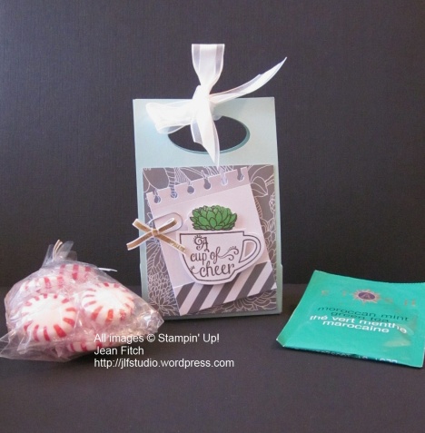
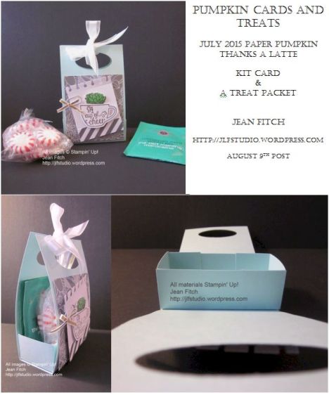
Here’s my simple 3D treat holder:

WCC30 - Susan's 3D Challenge - Jean Fitch

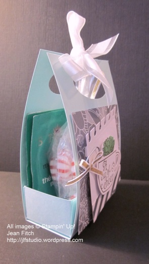
And a side view so you can see how it all fits together.

WCC30 - A Cup of Cheer - Side View - Jean Fitch

Do you remember this little treat or card holder?  People have been making them for over a decade (possibly more).   Perfect for little gift cards just under 3″ wide and about 3″ – 4″ tall.    Or in this case a little package of teas and sweets…perfect for someone recovering from a cold or flu or other malady.

I’ll let you in on a secret that I discovered years ago…the tea in the picture is Moroccan Mint tea from STASH.  That tea is a wonder drug all on it’s own.  Whether for morning sickness or the upset stomach and dizziness you get from chemotherapy this stuff is magic!   And I can guarantee you that it tastes just like the mint tea that I had in Morocco back in 1975.   The only brand I’ve found that does.  I’m not sure if it’s the lemongrass or the blend of various mint teas or the combination but this stuff is powerful…and very good tasting.   Fun to suck on a peppermint too and hold it in your teeth while you drink the tea through it.   Just don’t let the mint go down the wrong way.  Yeah…been there…done that.

And yeah…I should probably add the disclaimer that I’m not a doctor and take my suggestion with a grain of sense and salt.  It may not work for everyone as I’ve described but I’ve given it to many, many people for whom it did work and used it myself.   And no…I don’t work for STASH or get a commission.  LOL

Are you wondering yet where the stamps and several of the papers came from?   My latest (July) Paper Pumpkin is the source.  Three wonderful sentiments, the cup, tea bags, steam and the plants that you’ll be able to use when the kit contents are gone.    Have you tried that monthly pumpkin delight yet?  Trust me…you will want to.   Especially…because…drum roll please…you can get two months right now for 50% off!

Contact your demonstrator (I’m available if you don’t have one already Click the highlighted text to sign up :D) and ask them about the 50% off offer.   It’s available until September 10th.   Want the August Kit…sign up by August 10th…get going…what are you waiting for…today is the 9th!!!

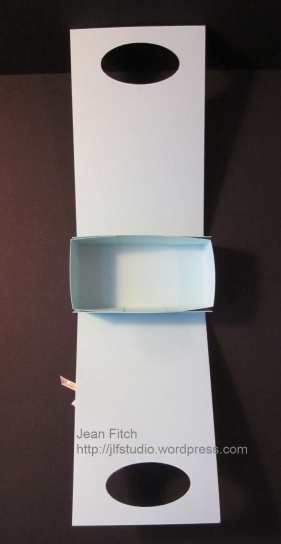
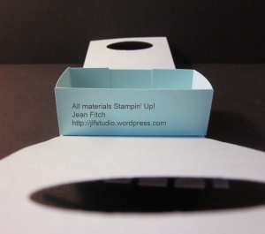
Here are a few other views of the inside with it open and treats removed.

 Click on the images to see a larger view


WCC30 - A Cup of Cheer interior

WCC30 - Cup of Cheer - inside box

Supplies:

Stamps: My Paper Pumpkin July 2015 Kit – Thanks a Latte

Ink:  Early Espresso, Cucumber Crush

Paper: Pool Party, Paper Pumpkin Kit papers and stickers

Punches: Large Oval

Other:  Clip from kit, 1/8″ Gold Ribbon, Whisper White Organza Ribbon, Small Cellophane bag,  tea bags, Stampin’ Trimmer, Dimensionals, SNAIL

It’s a fairly simple construction that you can adapt to any size.   In this case a 3″ x 11″ strip of cardstock that is scored at 4-1/2″ and 6-1/2″.  Use the large oval punch to create the handles near the top.   The small box is 4″ x 5″ and scored at 1″ all the way around on all sides.  Cut along the score line up to the other score line on two sides at both ends.  Fold and crease along score lines and adhere tabs as needed to form the box.   Adhere bottom of box to the inside score area of the long cover piece.  Decorate…tie some ribbon to hold the handles in and fill with your desired contents.

Thanks a Latte Treat Packet


************************

Please join the rest of the design team over at the Challenge blog website here to see the rest of the teams designs and to add your own with the linky doodad.  When you add your own design and there are more than three entries, one of you will be a challenge winner and have the option to place the winner’s badge on your own site.  Of course…you’ll also win bragging rights!

That’s it for this challenge.   You can see the winner for the linky added projects for the last challenge here.  It was a hard choice as all the entries were wonderful.  If you haven’t looked already…take a look here.  You’ll be inspired.   I also hope this time you’ll join in the fun and grab a friend or two as well and get creating!  Check the challenge site for rules on competing for this and future challenges.

Hugs and Blessings to all my friends and readers.

Jean Fitch in pink


WCC29 – Flap Fold Flowers

WCC29 Bev’s Special Folds Challenge

Welcome to a new Challenge.

This time around we are folding!

Pretty much any kind of card fold little or big.  Simple or intricate.  You decide.   If you have a different idea than the picture…go for it!

Here’s the picture that was provided to encourage the thinking and the MOJO.

Fun-Folds-All-Cards

 **************

Do you believe in kismet, coincidence or just blind dumb luck?   When I encounter that phenomenon I refer to it as inspiration.  LOL

Of course all of that also helped me to create this:


WCC29 - Wild About Flowers Flap Fold Card - Jean Fitch - Wild about Flowers & Trust God stamp sets

So how did I get there?

A week or so ago I had this wonderful tutorial by Julie Davison hit my inbox courtesy of SplitcoastStampers Weekly Inkling Newsletter.   Wonderful inspiration every Wednesday.  If you would like to get yours you can sign up for it on the home page of SCS here.  Of course I had to look at the gallery and came across this card (also by Julie Davison):

Tulip Flap Fold Card - Julie Davison

click the picture to see Julie’s post

All of that, the need for a card for the challenge plus a real hankering to play with my brand new stamp set Wild About Flowers put me on the road to creativity.

Needless to say…I had a very fun time learning a new fold and bending my own ideas into the fold parameters as well.   I always like a challenge.  Well duh…that’s why I work on our Wacky Watercooler Challenges. {grin}

I altered Julie’s basic design just a bit.  I added an Old Olive mat layer that creates a thin color border between the Pretty Petals designer series paper and that rather intense Pacific Point paper.  Hard to see in the photo but noticeable in the real card.   Of course I changed the stamps and the punch border but the rest is pretty much Julie’s design.  Now that I’ve done the basic design I have a few ideas for a stepped up version so check back.

Here are a few other views with the card unfolded.   If you don’t recognize the edging tool I used for the front flap…check out your punches.   I created the border with the Decorative Label punch.

 Click on the images to see a larger view

WCC29 - Flap Fold unfolded - Jean Fitch

WCC29 - Flap Fold top fold view

WCC29 - Flap Fold Side View - Jean Fitch

WCC29 - Flap Fold Front view - Jean Fitch

WCC29 - Flap Fold - inside folds - Jean Fitch

WCC29 - Flap Fold - front unfolded - Jean Fitch

Supplies:

Stamps: Wild about Flowers, Trust God, Lovely Amazing You (for the inside and still available for a short time)

Ink:  Old Olive, Pacific Point

Paper: Pacific Point, Old Olive, Very Vanilla Cardstocks.  Pretty Petals Designer Series Paper Stack.

Punches: 2-3/8″ Scallop Circle, 2-1/2″ Circle, 1-3/4″ Circle, 1″ Circle, Scalloped Oval, Decorative Label

Other:  Stampin’ Trimmer, Dimensionals, SNAIL

I love the way the design from the Pretty Petals paper stack mimics the cornflower images I selected.  I’ve had a scrap of this paper sitting on my desk for a while now so not surprising I opted to use it.  I used the flip side to create the vest take out box you saw here.  Stampin’ Up does such a wonderful job of giving us papers and stamps that work so well together don’t you think.  Not to mention the general coordination of colors across many product types.  Love that!   Loving the new catalog too!

************************

Please join the rest of the design team over at the Challenge blog website here to see the rest of the teams designs and to add your own with the linky doodad.  When you add your own design and there are more than three entries, one of you will be a challenge winner and have the option to place the winner’s badge on your own site.  Of course…you’ll also win bragging rights!

That’s it for this challenge.   You can see the winner for the linky added projects for the last challenge here.  It was a hard choice as all the entries were wonderful.  If you haven’t looked already…take a look here.  You’ll be inspired.   I also hope this time you’ll join in the fun and grab a friend or two as well and get creating!  Check the challenge site for rules on competing for this and future challenges.

Hugs and Blessings to all my friends and readers.

Jean Fitch in pink


WCC28 – Sending Wishes

Watercooler Challenge #28

WCC28 Buffy's color challenge

Buffy’s Color Challenge

Welcome to a new challenge.  This time Buffy has tossed out a unique grouping of  five colors and dared us to do our best!   After just a bit of grumbling…and a few questions about the sanity level she enjoys…hee, hee….we all buckled down to creating.  And I have to admit…I’m now interested in making a few more cards with this color combo!  I think too that I finally figured out their appeal.  They’re all tones found in Vintage creations from decades and possibly centuries past.   All together they reinforce that look and feel.  Yep Miss Buffy…you converted me. 😀

After a good bit of head scratching…and truthfully…a bit of looking at other entries on our Design Team site (I swear…at least a few of my sister artisans stole my first ideas!)…here’s my entry:


WCC28 - Buffy's Color Challenge - Sending Wishes  by Jean Fitch

What do you think?   Does this reflect a bit of vintage look and feel?   The more I look at it the more I think of my Grandmother’s handkerchief box.  Many of them delicate with embroideries or printed patterns of flowers and butterflies and yes…many with these same colors!   And keep in mind…my grandmother was born in the late 1800’s.   And her handkerchief box reflected the various years…and also included some from her own mother.  Now I’m wondering if I should have gone with a faux silk background to get even closer to those handkerchiefs.   Hm…maybe next time.

Supplies:

Stamps: Butterfly Basics, Floral Wings (hostess set)

Ink:  Pool Party, Wisteria Wonder, Pink Pirouette, Melon Mambo, Rose Red, Early Espresso

Paper: Pool Party, Wisteria Wonder, Pink Pirouette, Melon Mambo, Rose Red, Whisper White

Punches:  Bitty Butterfly

Other:  Big Shot, Oval Collection Framelits,  Rhinestone Basic Jewels, Dimensionals, SNAIL

The trickiest part of the card, I found, was deciding which color butterfly should hang out with which colored flowers.  Finally, before my head could explode I decided to simplify it and keep color with color.  Easy peasy.  So why did it take me most of a day to figure that out!

************************

Join the rest of the design team over at the Challenge blog website here to see the rest of the teams designs and to add your own with the linky doodad.  When you add your own design and there are more than three entries, one of you will be a challenge winner and have the option to place the winner’s badge on your own site.  Of course…you’ll also win bragging rights!

That’s it for this challenge.   Sadly we didn’t have a winner for the linky added projects last time.  We need three or more submissions to award that prize.  I hope this time you’ll join in the fun and grab a friend or two as well and get creating!  Check the challenge site for rules on competing for this and future challenges.

Hugs and Blessings to all my friends and readers.

Jean Fitch in pink

WCC26 – Lemonade anyone?

WCC26 – Jean’s Lemonade Pie Color Challenge

Welcome to a new Challange.  This time around we are focusing on three colors and if you want you can also use the picture for inspiration…or just let it make you hungry!  LOL

The official start of summer is just a few short days away.  Well alright…more like a week.  But hey…Mother Nature has been getting in some practice in my neck of the woods with an early start on turning grass to hay and soaring temperatures.   So I thought…what better time for lemonade pie and colors that will also work for Father’s Day…also coming up in a hurry.

Check it out.  Isn’t that pie scrumptious?   I like the china plate and the table runner too!   If you want to make the pie…here’s the recipe link  If you want to play along…check out the information at the bottom of the post.

WCC26 - Watercooler Challenge -Lemonade Pie Color Challenge - June 14 2015Here’s my version…non edible but it has soft and fluttering butterfly embossing, a cool trick with the Note Tag punch from Stampin’ Up and a few other yummy bits and pieces.   Best of all…whether it’s given for Father’s Day or another occasion…it tells the recipient how much they are loved.  Click the picture to see all the detail close up.

WCC26 - Jean's  Lemondade Pie Color Challenge - recipe included!

Supplies:

Stamps: Lovely Amazing You (still available for a short time), Papillon Potpourri

Ink:  Marine Mist, Daffodil Delight Classic Inks

Paper: Crumb Cake, Blackberry Bliss, Marina Mist, Daffodil Delight, Very Vanilla

Punches: Note Tag, Itty Bitty Accents Pack (heart), Bitty Butterfly, Banner

Other:  Big Shot, Fluttering Embossing Folder (new),  1/4″ Daffodil Delight Cotton Ribbon, Rhinestone Basic Jewels, Dimensionals, SNAIL

I wish this design had shown off the very cool Fluttering folder a bit better.  Perhaps I need to sponge some color onto the layer to show off the wings.  This new and very cool folder is a new 6″ x 6″ size and trust me when I say…you are going to love it and want it.  The new catalog is all about the butterflies this year.  Well…cake and cupcakes makes it in too…and of course trees, flowers…and more.  But really…look at the butterflies…that’s a big trend…and I’m loving it!!

The newish cotton ribbon is pretty cool too.  Soft, silky and very easy to tie.  Yes it was in last years catalog but somehow I never got around to trying or discovering it.  Yep…I do foolish things sometimes.  If you don’t want to follow in that path…try it!  ’nuff said.

Tool tips: Note Tag punch does more than tags.  Are you wondering what die was used to create the window layer?  No die…it’s the Note Tag punch!  Brenda Quintana has a fun video showing how to create this window and others.   I used a square of 3-1/4″ for mine.

************************

Join the rest of the design team over at the Challenge blog website here to see the rest of the teams designs and to add your own with the linky doodad.  When you add your own design and there are more than three entries, one of you will be a challenge winner and have the option to place the winner’s badge on your own site.  Of course…you’ll also win bragging rights!

That’s it for this challenge.   Sadly we didn’t have a winner for the linky added projects last time.  We need three or more submissions to award that prize.  I hope this time you’ll join in the fun and grab a friend or two as well and get creating!  Check the challenge site for rules on competing for this and future challenges.

Hugs and Blessings to all my friends and readers.

Jean Fitch in pink

Watercooler Challenge – WCC25 – Mandarin Wetlands

WCC25 – Mandarin Wetlands

also known as Kath’s Challenge Photo

For this challenge my fellow artist Kath provided us with a beautiful photo of what I think is a Mandarin duck.   Beautiful isn’t it? I kept coming back to the photo (I finally put it on my desktop) trying to decide on the colors I wanted to use.  Using feathers or a bird image or the idea of water was a given for me.  It was the colors that kept my brain running in circles.  There are so many wonderful ones to choose from don’t you think?  And surprisingly some have an almost neon look too.  How does Mother Nature do that? Got me thinking that Stampin’ Up needs a copper metallic paper…don’t you agree?

WCC25 - Kath's Inspiration Photo Challenge

 **********

Here’s what I finally came up with:

Watercooler Challenge WCC25 - Mandarin Wetlands - Jean Fitch

Now if only my camera could have shown the right shade for the Crisp Cantaloupe! (ARGHH).   With the retirement of so many favorite products only days away I took the opportunity to bring out some of the ones I will miss featuring the most for another playtime.   I was late to the party in loving Crisp Cantaloupe…I know…dumb huh?   But now I can’t stop picking it up and working it into any number of designs including this one.  Until this week I hadn’t even realized how beautifully it pairs with Cajun Craze.  In looking at our inspiration photo at first I was caught by the darker and brighter colors…then I looked a bit more closely and what do you know…there were a few almost pastel shades to offset the deeper, darker colors.  Can you see the Cantaloupe color in the small section of the neck?  The Cajun Craze & Early Espresso were a no brainer for me and the Night of Navy was a nod to the slightly more neon blue that shades to a deep purple.

Then I scratched my head about how to show the feathery texture and the edging of cream color that seemed to outline so many colorful sections of this beautiful bird.  Then my eyes lit on my Sahara Sand Lace from the soon to be gone Occasions Catalog.  Perfect!  After all sand and water birds go together right?  That outlining as well as the water ripples was also the inspiration for the scored lines at the top of the Crisp Cantaloupe layer.  I’ve seen quite a few cards on Pinterest that use the scoring technique as an accent and it was fun to give it a try for myself.  Especially since I didn’t want the lace edging overwhelmed by an overall embossed layer.

The use of the Wetlands stamp set (thankfully not retiring) was a tough choice in some ways.  I wanted to play with the retiring Four Feathers but decided in the end that ducks had a lot in common with other shore birds and I wanted something a bit delicate to go with the lace.  I heat embossed two stampings of the single long image from the set with Whisper White Craft Ink and then Whisper White embossing powder on my Early Espresso paper then punched sections from both stamped images with the 1″ square punch.   The mat layer was a nod to the new catalog using Tip Top Taupe with the retiring Postage Punch.   Why oh why did Stampin’ Up have to choose that punch when looking to make room for new ones.   Sigh…it was the perfect layer for the 1″ Square punch don’t you think?   And you know how much I love creating layered inchies.

Supplies:

Stamps:  Wetlands, Label Love (retiring)

Ink:  Whisper White Craft Ink, Night of Navy Classic Ink

Paper: Cajun Craze, Crisp Cantaloupe (retiring), Early Espresso, Night of Navy, Tip Top Taupe (new In Color) Cardstock

Punches: Artisan Label (retiring), 1″ Square, Postage (retiring)

Other:  Heat Tool, Whisper White Embossing Powder, Sahara Sand Lace (Occasions Catalog and thankfully carrying over to the annual), Sticky Strip, Dimensionals, SNAIL

Tool tips:

1) To create a grouping of scored lines you need to take your courage in hand and allow yourself to freehand the look.  Start at your desired point and then draw lines of varying lengths 1/8″ apart.  The Simply Scored Board is perfect for this technique since the entire board is sectioned in 1/8″ lines. 

2) To create the mat for the sentiment – punch another Artisan Label shape in a contrasting color.  Cut the piece in half across the middle, snip the bottom corners and adhere each section to the back of the stamped punch piece.

**********

Join the rest of the design team over at the Challenge blog website here to see the rest of the teams designs and to add your own with the linky doodad.  When you add your own design and there are more than three entries, one of you will be a challenge winner and have the option to place the winner’s badge on your own site.  Of course…you’ll also win bragging rights!

That’s it for this challenge.   Don’t forget to check the Watercooler Challenge Blog post here to see who was the winner of the last challenge submissions by linky artists.    Check the challenge site for rules on competing for future challenges.

Hugs and Blessings to all my friends and readers.

Jean Fitch in pink

WCC02 – CASE THE NEW CATALOG – Watercooler Challenge


CASE: Copy and Share Everything.

I’m totally loving the new Watercooler Challenge Blog.   It’s a new kid on the block as card challenges go but promises to be fun and since many of my Watercooler friends are on the design team it seemed a friendly and fun place to get my feet wet in the Challenge arena.

Have you ever been stuck for a place to start a new card.  Wondering what design features, what stamps, colors and so on would work together….check out the world of Card Challenges and especially the Stampin’ Up catalog!    While Stampin’ Up no longer officially calls it’s catalog an Idea Book it still works that way for me.  Many talented concept artists create the samples shown in the Annual Catalog and I find that a truly inspirational place to start.

For my first jump into the  world of card challenges…here’s my CASE of the Circle Card Thinlit die sample on page 138.  What I call a Circle Flip Card.    To see the samples the Watercooler Team came up with as well as other entries to the challenge visit this post.

CASE the Catalog - CASE of Stampin' Up's 2014 Annual Catalog page 138 - Jean Fitch - Circle Card Thinlit die, Trust God, Petite Petal and the Arrow embossing folder and Moonlight DSP.   More pictures and details in post.

WCC02 CASE the Catalog Watercooler Challenge

Supplies:

Stamps:  Trust God, Petite Petals

Ink: Basic Gray, Basic Black Stampin’ Write Marker

Paper: Hello Honey, Lost Lagoon, Whisper White, Vellum Cardstock.  Moonlight DSP stack

Punches:  1-3/4″ Circle, 2-1/2″ Circle,  Bitty Butterfly, Petite Petals

Other: Big Shot, Circle Card Thinlit Die,  Arrow embossing folder, Whisper White Baker’s Twine, Rhinestone Basic Jewels, dimensionals and glue dots

All products Stampin’ Up unless otherwise noted.

**************************

The very cool thing about this die are the options you have.   The basic card die creates a simple flip.  I decided to add an extended fold to it (hidden until you open the card) to allow a bit more scope for my written message once I add that and send it off to the friend who encouraged me to jump into the challenge (hi Miss Marsha!).   Then there are the many additional dies that come in the set ( 10 in all including the basic card die) that make layering fun.  For a quick tutorial on how to add that extended flap I have the video pinned here.

The first change to the CASE I made after the added flap was the color choice.  I decided to showcase this years new In Colors instead of last years.   So Hello Honey and Lost Lagoon teamed up for the first time in my stamp studio.    I had a wee bit of trouble getting the Arrow embossing folder just right (next time I’ll now to change the sandwich to a tighter fit) so I altered and added the strips of designer series paper (the new Moonlight DSP paper stack reflected the arrow theme perfectly!) as needed.    I also decided that the die cut chevrons would look better reflecting the arrow pattern of the paper so I fit them  into the tracks created by the embossing folder.    I don’t know about you but I’m loving this folder that carried over from the earlier Occasions catalog.   It fits the Prairie School or Arts & Crafts design styles from earlier decades to a T – Prairie School is one of my favorite styles that architects like Frank Lloyd Wright made popular.

Here are a few views of the card from different angles that also show a few of the extra die pieces from the card set that I used:

CASE the Catalog - CASE of Stampin' Up's 2014 Annual Catalog page 138 - Jean Fitch - Circle Card Thinlit die, Trust God, Petite Petal and the Arrow embossing folder and Moonlight DSP.   More pictures and details in post.

Three tips:

Tip 1: As you can see from this back view of the front flip circle I die cut another scallop circle using the die that comes with the card set.   You may not know this…but the scallop die in this card set is identical in shape and size to our 2-3/8″ Scallop Circle Punch.   Since I don’t yet have this punch I’ve been able to use the die in it’s place for many, many projects!  Score!  That’s $16.95 I was able to put towards a new stamp set!

Tip 2:   When you don’t have a circular stamp to use to step up a punched image…grab your Stampin’ Up Project Life journaling pen or a coordinating Stampin’ Write Marker.    I used the heart die in the set to create a window and then realized the threads peeking through weren’t exactly the look I was going for so I die cut another heart in Mossy Meadow and inserted into the Lost Lagoon scallop piece.    Looked a little plain and I wanted to echo the circle motif I had going on so I grabbed my Basic Black Stampin’ Write Marker and added my sentiment.   It’s those personal details that really share the love don’t you think?

Tip 3: When you create with these flip cards keep in mind how you will deliver it to your intended recipient.   If you add rhinestones or other hard accessories to the back of the circle it will leave marks on the layer underneath when you fold the card and mail it.  If you are hand delivering it’s probably not as much of an issue but a trip through the post office has the potential to leave all kinds of indents from things like jewels and buttons and so on.  Something to think about as you design.  Flatter is better on the under layers.

Here’s the back view of my full card.  I left that extra back flap unembossed for easy writing before I pop it in the mail.   And speaking of mailing…this is one of those cards that will likely take a bit of extra postage what with the flap, layers  and rhinestones that I’ve added.  If however you keep the card simple and less dimensional the flip cards will mail just like any other standard one layer card.

CASE the Catalog - CASE of Stampin' Up's 2014 Annual Catalog page 138 - Jean Fitch - Circle Card Thinlit die, Trust God, Petite Petal and the Arrow embossing folder and Moonlight DSP.   More pictures and details in post.


CASE the Catalog - CASE of Stampin' Up's 2014 Annual Catalog page 138 - Jean Fitch - Circle Card Thinlit die, Trust God, Petite Petal and the Arrow embossing folder and Moonlight DSP.   More pictures and details in post.

Here are the two main ingredients you need to CASE this card:

arrow embossing folder

Stampin’ Up’s Arrow textured embossing folder. Item# 132187

To see more fun examples of what you can do with this cool die set check out my Pinterest Board for flip cards here.

Circle Card Thinlit die store image

Circle Card Thinlit Die (10 pieces) – Item# 133480


Thanks for joining me today and I hope you’ll check out the Watercooler Challenge Blog.   And don’t let the Canadian spelling you may find there throw you for a loop.  Really…we do speak the same language.  LOL

Hugs and blessings…

Jean Fitch in pink

My Digital Studio – A sale is coming and one last free download! Plus…have you heard about Black Friday yet?

Hi all,

Here’s a cute little guy I created today when I took some time out from writing posts for the next week and instead played with the digital punches in My Digital Studio.  You can see what else happened to him at the bottom of the post.   I’m not the only one who gets holiday headaches…lol!


I probably should have subtitled this post…Black Friday is no longer on Friday!

With all the Online Extravaganza posts I’ve been concocting lately I’m feeling a bit like the shouting ads coming through my in box.   Black Friday is coming, Black Friday is coming shout all the online and big box retailers – well yeah – but according to the ads in my in box it’s already here and has been for about a week.   Last Saturday’s ad for a local craft store touted their Black Friday sale that started that day – how is it Black Friday when it’s two weeks before Thanksgiving for pity sake.   Funny how date creep works don’t you think?    Holidays and sales days and so many other days get started weeks and weeks before they used to.    Makes me thankful for sensible companies like Stampin’ Up.   

Yep we too have a sale and trust me there is nothing black about it except possibly the ink on the digital page!  Hee, hee.   They sensibly called it the….

And they used lovely shades of blue and red.   To see more about what’s coming at 12:01 a. m. on Monday check out this post.

Now really…you can have an online extravaganza any time of the year whether a Friday is Black or not and whether or not there is a holiday in sight.  Is that sensible or what?   

The one confusing thing about it is (it’s a sale so of course there has to be something confusing about it right?  Isn’t that a rule somewhere?) …you can order from the selections offline as well!   Sale items (except for one or two digital downloads or Clearance Rack items) can also be ordered on regular customer and workshop orders – demo orders too if you happen to be a demo or want to join as one this week.  But I digress….

To make it even better…Stampin’ Up started the fun early (yep we do things early too) with several days of free downloads for My Digital Studio (or any other graphics software you have on your system).

All of which is to say…TODAY IS THE LAST DAY FOR A FREE DOWNLOAD!!  So grab it now!!

Yep…click on over (then come right back okay) here to see and download a very fun Trim the Tree set of embellishments and designer projects like this one:

For a closer look at the free download I’ve created an Index Sheet with all the info you need to get started once you have the download on your system.

Trim the Tree – Index Sheet

And starting Monday at 12:01 a.m. you can get $40 worth of bundled downloads for free when you buy  My Digital Studio Express Version!  

The cool thing about the Express Version is 1) it’s cheaper than the full 2 disk version (by about half) 2) those savings allow you to invest in downloads of images you’ll love and use and 3) you don’t have to pay shipping and you can start using it without waiting for UPS to deliver the disks to your door!   Just download and go after paying for the program.  Way to go SU!

To see more about the differences between the Express version and the full 2 Disk version here’s a wonderfully informative video by Stampin’ Up’s Holly Linford

showFullScreen?id=6293347%3AVideo%3A227744&autoplay=1

I’ll leave you today with a fun postcard project I created today using another special My Digital Studio offering.  

Many of the elements of this project come from our new Savor the Season Hostess CD-rom.   Savor the Season is filled with fun predesigned projects including boxes and tags and bows as well as papers and stamp images and is only available as a Hostess option.   Have a workshop or place an order that qualifies for hostess benefits and you too can choose Savor the Season as one of your free product options and start playing.   In fact…during the Extravaganza Sale you can order the Express version of My Digital Studio as well as other product from my online store here and not only will you get the $40 of free bundled software but if you spend $150 (before shipping) you’ll also qualify for $25 in free hostess product ($16 of which will get you Savor the Season for free).

What you won’t find in the digital kit is my gingerbread man image.  I created him using punches that come standard with My Digital Studio!   I’ll post the details later this week.

Here’s my Index Sheet for Savor the Season as well as a video and copy of the flyer with ordering info:

Savor the Season Stamps – index sheet

*****

Don’t forget to check back later in the early a.m. to see the Online Extravaganza specials. Including the two that are only available for 24 hours!

Hugs and Blessings and may your week ahead be filled with joy – Jean

Quick Tip: Stampin’ Up’s Ribbon Dotted Scallop Ribbon Border Punch works for Counted Cross Stitch!

Hi All,

Just a quickie post tonight.  I wanted to show you my latest addiction…actually a renewed addiction – Counted Cross Stitch Stampin’ Up style!

Year’s ago and back when my eyes were still eagle sharp I was a Counted Cross Stitch freak.  I have almost nothing to show for it as I tended to give away everything I made but most days found me with a needle in hand adding color to aida cloth.  There are a few incomplete pieces that maybe one day I’ll finish and keep for myself…sigh… another item for the to do list.   😀   

Anyway when I got a chance to play with the Dotted Scallop Ribbon Border Punch (more commonly known as the ribbon punch) I realized the spacing was perfect for cross stitching.  And I couldn’t resist playing with the idea.  Turns out the White Baker’s Twine from the Summer Mini is the perfect pairing.  Slightly thinner than the mixed color versions and no worries about how the striping will work on the stitches too.    This little tag card  is from a May Stamp Camp and  a set I created to fit inside the Milk Carton from the Mini Milk Carton die also from Stampin’ Up.  Turns out you can fit about 12 of these little beauties inside the mini milk carton.   When I get a good picture of the birdhouse Cheryl made from the milk carton I’ll show you the rest of the little mini cards.  The sizing on the little cards is 1-1/2″ x 1-3/4″ (folded).   Great little scraplings basically and limited only by your imagination and the scraps on your table.

I could also say this is a sneak peek from the new Idea Book & Catalog coming July 1.   Both Pretty Postage stamp set and the Bakers Twine are in the new catalog!  YAY!

Supplies list:

Stamps: Pretty Postage (Summer Mini & new IBC)

Ink: Cherry Cobbler Classic Ink

Paper:  Cherry Cobbler, Not Quite Navy & Crumb Cake Cardstock

Other: Small Tag Punch, Dotted Scallop Ribbon Border Punch, White Baker’s Twine, needle

I used my Stampin’ Up White Gel Pen to mark where you would make your first set of  diagonal stitches then go back the other direction to make the crosses.   Quick and easy and I can do a short piece like this in under 3 minutes.

*****

Don’t you think this little guy has a bit of a nautical feel (maybe its just the colors everyone is using with Open Sea these days)?  Did you know sailors used to do needlework too?  Besides stitching and repairing the canvas sails?   I’ve seen some amazing examples of Colonial era sailors stitch work in East Coast museums.   Hm…wonder if those tuna fisherman today keep up the traditions?   

May your stamping dreams be filled with little x’s….

Hugs and blessings – Jean

Tool Time Tips: Sanding Block…a true Paper Technicians tool!

Hi All,

Don’t you just love that term Paper Technician?   Makes me and my fellow crafters sound like engineering types or something.  Could make for an interesting line on a resume too…what do you think?

And with a title like that I feel I should be doing Tim the Tool man Taylors –  More Power…ARghhh, Arghhh…ARghhh….

Kinda how I feel about my Big Shot too…but I digress…..

*****

Ah…the lowly sanding block.  One of the more frugally priced tools in the catalog and often overlooked.   Love these little guys and for more than curing a rough nail when an emery board isn’t in sight.

Of course they’re perfect for just what you’d think – sanding rough edges on paper or creating rough surfaces on the paper – otherwise known as distressing.  And before the advent of our new distressing kit the only tool in my SU catalog for making chipboard and DSP die cuts play nice together (i.e. smoothly). 😀

Product Details:

Sanding Blocks – # 103301, $3.50

Quantity:  2 per package
  
Use to distress paper and card stock and to smooth chipboard before covering with ink or along the edges after paper and chipboard have been joined  together.

 Use with a forward and backward motion. 


Sanding blocks are great for smoothing rough edges that result from tearing perforated paper and if your sanding blocks get dirty, simply wash them under running water.   They can also be used to scuff up new rubber stamps so the ink adheres better to them.


Tip:  As mentioned above the blocks can be used to lightly condition your new stamp images – especially the bold ones with lots of flat spaces that often don’t take the ink as well as you would like.   For best results spray stamp with stamp cleaner and rub with a cloth or use your Stampin’ Scrubber vigorously…this will remove any residue from the manufacturing process.  Then lightly stroke the sanding block across the image to lightly rough up the rubber.  Scrub the stamp once again to get rid of any detritus from the sanding process.  Then ink and stamp.  If you compare the first non conditioned image with the new conditioned image you’ll see quite a difference.  You might also want to apply Versamark ink before inking with your selected color of ink the first few times you use the stamp.  The more viscous (but clear) Versamark will grab and hold onto more of the classic ink as well as adding to the conditioning process of the stamp.   


Other uses for the blocks:

Distressing hodgepodge hardware especially the brads leads to a different more vintage look.  Sanding over a stamped heat embossed image can be cool too, especially with the metallic embossing.    Even sanding over an old photograph can be interesting.   Makes new stuff look old when you add scratches to it.  Probably why the Sanded background stamp seems to be so popular.   Cutting metal Flashing with a Big Shot is pretty popular right now and you can sand those flashing pieces too for an interesting look. 

Here’s Links to a few more techniques and tips:

http://andreawalford.com/trigger-tuesday-technique-tuesday-in-one  – distressed pastels

http://dostamping.typepad.com/dostamping_with_dawn/2010/10/frosted-impressions-and-seasonal-sentiments.html – sanded embossed window sheets

http://createdbyu.blogspot.com/2010/09/super-saturday-tutorial-two-glass.html – sanded glass glitter

http://www.stampinpretty.com/2009/04/darling-dots-under-control.html – conditioning with a block

http://www.createwithpaper.com/createwithpaper/2010/07/sanded-embossing-technique.html – DSP and  block

http://www.facebook.com/note.php?note_id=143446904743 – distressing paper, brads, etc.

 ********************************************************************************

My apologies for the odd spacing and lettering on the post.  WordPress is acting quirky tonight and not it’s usual compliant self.  Silly beast keeps stopping to save every 28 seconds too!  ARGHHHHH!

Hope that gives you a quick overview to an overlooked tool and some fun techniques to try out once you have some blocks of your own.   Of course if you need some I’d be happy to take your order – lol!

Hugs and blessings – Jean