Wacky Watercooler July 2016 Blog Hop: Our Third Anniversary Celebration!

Wacky Watercooler 3rd Anniversary Celebration Banner

Welcome to our July Third Anniversary Celebration Blog Hop

Hello and Welcome to the third anniversary of the Wacky Watercooler Blog Hop series.  After three years together I can’t help feeling I should be making Anniversary cards for each of my hopping buddies.  I love my fellow artists and you dear readers as well, for sticking with us, and visiting today!

Who are the Wacky Watercooler Artists?   Most of us are Stampin’ Up demonstrators (or were when we started the hops) who hang out in a back corner of our company chat site and do precisely that…chat.  We’ve shared our ups and downs.  Funny and sad lives and stories for so long that even though most of us only know each other from online or the occasional meet up at conventions or on the phone you’d believe we’ve been neighbors for years!   It’s amazing how close we’ve gotten and how the friendships have grown.  Bless you Internet and Bless you Stampin’ Up!

It’s hard to believe it’s been 3 years since we started the hops.  At the beginning I was the captain and I was honored to lead such a wonderful gang of friends and rubber stamping artists.   Behind the scenes was so much fun (and occasionally challenging) coming to consensus for designs and hop policies as we got started.   We’re all strong minded but with loving spirits so the best of the best always came out in the end.   If you’ve been following us for all that time you know that Heidi is now at the wheel of the bus and is also our able and beloved captain and there have been a few other changes in the line up over the years.   I’m jazzed that so many who were in at the start are still regular contributors and even more that Heidi was able to bring the entire gang from the first hop back together to join the celebration along with newer members of the band to share some inspiration.  If you are as nostalgic as I am you can see the very first hop here.

As usual you can follow this hop in a circle going either direction.  Of course you can also return to the home hop site if you ever get lost along the way.   That site will also, with a bit of scrolling back lead you to any and all of our past hops that you might still find inspiring.   In fact…we’re hoping to lead you there with many of our CASE projects this time around from the original hop.  Enjoy!

Now that you’re here I hope you’ve arrived from  Gail’s blog.   Gail is another dear friend I first met in the Watercooler.  She’s also one of our many (and talented) Canadian stampers.   I seem to be bracketed by my sisters from the north this hop. {grin}   I hope you found her as inspiring as I always do.  While not an original hopper Gail has jumped in with a heart and soul that keeps the Watercooler itself (and our hop) hopping with her original take on life and stamping.

*******

Today’s hop, as part of our celebration has us featuring older stamp sets that are still current on our stamping shelves – a mean feat for some sets to last that long don’t you think?  Two in particular.  Gorgeous Grunge and Wetlands you’ll see as you follow along through the hop.  Of course we may throw in other sets as well to keep it interesting (or ones we hope will still be around in another 3 years).  At least I did.  LOL

Here’s my first celebratory offering.   Appropriate don’t you think that it’s mixed with a set called Picture Perfect.   Beaches and wetlands so often are don’t you think?  A perfect picture?  And also gorgeously grungy?  Sorry…I couldn’t resist saying that. 😀

The secret ingredient is gold.  Check the directions I’ve shared in PDF form and you’ll see touches of gold everywhere that add to the texture.

Picture Perfect Starfish

(click the image for a larger view)

 Picture Perfect Starfish on the Beach - Jean Fitch - Wacky Watercooler Hop 07/21/16

Inside

Picture Perfect at the Beach - Jean Fitch - inside - Wacky Watercooler Hop 07/21/16 - Jean Fitch

A version closer to Penny’s with a wonderful and inspiring sentiment from Rose Wonder.

Picture Perfect Star Fish - Rose Wonder - Jean Fitch

And a detail of the gold embossing that gives the starfish so much life and texture.

Starfish Detail - Jean Fitch

Note:  This lovely design is a CASE of fellow artist Penny Hanuszak who shared the original version on a Watercooler Wednesday Challenge posting a few weeks ago.  Thanks Penny!  I added a sun and different sentiments to change it up just a bit.  Check the post for Penny’s directions or my own PDF below.

Do you have Gorgeous Grunge yet in your stamping arsenal?  It took me a while to add it to mine but now it’s there that speckle image is one I reach for time after time.  Here I’ve also gotten the lined image baptized with ink.  Another popular image for creating roadways and waves in their respective places.

Do you remember that saying that “today is the first day of the rest of my life”.  It was popular as a philosophy and even in song back in the day.   Probably why I fell in love with the Suite Sayings “Forever begins today” sentiment.  Possibly it’s just me but I find it applies to so many occasions.  I’ve left a sentiment off the inside of this so I can decide later on the occasion Forever will be paired with.

Supplies:

Stamps: Gorgeous Grunge, Kinda Eclectic, Picture Perfect, Wetlands, Suite Sayings.

Ink: , Early Espresso, Crumb Cake, Island Indigo, Crushed Curry, Soft Suede, Versamark

Paper:  Soft Suede (5-1/2” x 8-1/2”), Island Indigo (4″ x 5-1/4″), Crumb Cake (3-1/2” x 3-1/2”) for the Starfish, Whisper White (3-3/4″ x 5″, 4″ x 5-1/4″)

Other: Gold Embossing Powder, Heat Tool,  Stampin’ Sponges, Paper Snips, Dimensionals, Glue Dots, SNAIL

Picture Perfect Star Fish-Jean Fitch – PDF directions and dimensions

Tool Tip:  Do you remember this old trick for keeping your sponges organized?  A punch piece folded and stapled to the bit of sponge with the paper and title that reflects the ink color.   I’ve added to it with a plastic cup to keep the sponges in while working with them so I don’t get ink all over the table (or where I don’t want accidents to happen on projects in progress).

Sponges for coloring

***********

Next up is a fun popup Spring Fold card using our stamp and punch combo Grateful Bunch.  I also used the brand new copper embossing powder.  I wish you could see this in person.  Much more coppery!

Pop up Grateful Bunch Spring Card

Grateful Bunch Spring Card - WW Hop 072116 - Jean Fitch

View from the back

Grateful Bunch Spring Card - back - Jean Fitch

Collage that shows you the full front, side and folded flat

Grateful Bunch Spring Card Collage Image - Jean FitchAs you can see from the pictures the card folds flat for mailing.  The flat size is a 4-1/4″ square so it’s perfect for our regular envelopes.   This version made use of our new Peekaboo Peach In Color.  Another color combo that has a bit more zing a bit less vintage look uses Watermelon Wonder.   My sideline Linda made off with that version before I could take a picture so I’ll have to share that version at a later date.  Smart woman.  The stampers at the Stamp Camp where I debuted this all loved the Watermelon Version and grabbed for those papers.  Myself…I rather like the vintage look of the peach.  A bit Victorian don’t you think?

Supplies:

Stamps: Grateful Bunch, Rose Wonder

Ink: Soft Suede, Mint Macaron, Versamark, Peekaboo Peach

Paper: Mint Macaron (4-1/4” x 8-1/2”), Soft Saffron (2-3/4” x 2-3/4” & 1-3/4” x 1-3/4”), Peekaboo Peach (2-3/4” x 2-3/4” & 1-3/4” x 1-3/4”), Whisper White (2-1/2” x 2-1/2”). Measurements apply only to the colors you choose to use. White and Background color scraps.

Punch: Blossom Bunch

Other:  Stampin’ Trimmer, Bone Folder, Heat Tool, Copper Embossing Powder, Copper Metallic Thread, SNAIL, Glue Dots, Dimensionals.

Here’s the directions in PDF form and if you don’t have a bone folder yet…you’ll want one now!

Pop Up Grateful Bunch Spring Card Hop Version-JeanFitch

And a link to Dawn’s video that showed me how the folds work for the basic Spring Card.  The decorative design is mine (grin):  https://youtu.be/LE5p70Rwx9s

***************************

I encourage you to play with the products that I’ve showcased today.  As you can see, they coordinate with products you may already have or can find in our new Annual Catalog.

*******

That’s it for my share of the hop.  Time to move on over to my friend  Terri’s blog   Terri and I met up online originally and then in person at a Stampin’ Up! convention.  One of my fondest convention memories ever!   We’ve been friends ever since.  So many of her fun, interesting and inspiring projects have landed on my CASE lists over the years that I’m expecting that to be the “CASE” this time around too! {grin}  Can’t wait to  see which of her wonderful projects I’ll be making next!   Terri is another one of the original hoppers.   Take it away Terri and Happy Anniversary!

To follow the hop click on the link below:

next watercooler crock button

Home Button

Previous Button

Save

Save

Save

Save

Save

Save

Save

Save

Save

Save


Save

Save

Save

Save

Save

Save

Wacky Watercooler June 2016 Blog Hop: New Catalog Open House

Wacky Watercooler New Catalog Hop 2016 June Banner

Welcome to our June New Catalog Open House Blog Hop

Today we’re opening our hearts, homes and studios to the New 2016-2017 Annual Catalog.   Hopefully you’ve had that little darling of a catalog in your hands already for a week or two.   And I hope you will agree with me that it’s the best catalog ever!   Yeah…I know…I say that every year…but this year I really mean it! 😀   So many wonderful items carried over from my favorite ever Occasions Catalog and even better…new toys (er…creative tools) to play with for the next 12 months.

Now that you’re here I hope you’ve arrived from  Marsha’s blog.  Marsha and I have been friends for years and often bounce ideas off each other.  Today is no different since Marsha never fails to come up with interesting and inspiring projects that always land on my CASE list!  Can’t wait to go back and see which of her wonderful projects I’ll be making next!

As usual you can follow this hop in a circle going either direction.  Of course you can also return to the home hop site if you ever get lost along the way.

*******

For today’s “open house hop” I’ve decided to share the same cards I shared at last Saturdays live open house.  Friends were able to make these next two cards and play with new colors, new punches, new images and of course new Big Shot bits and pieces (as well as the returning favorite Woodland embossing folder).

Now that we are into June Stampin’ Up has returned the Woodland Embossing Folder to the lineup.  It departed for a short time after the Holiday Catalog retired last January but after an outcry from customers and demos alike they brought it back.  If you’d like a repeat of that for the Cups and Kettles dies and stamps from Occasions call Stampin’ Up at 1-800-782-6787 and share your thoughts!

Please note:  If you would like the directions to either of the following projects please drop me an email or leave a comment.  I’ll be happy to pass them along.

Foxy Friends in the Woodland

Wacky Watercooler June Blog Hop - Foxy Friends in the Woodland Duet - Jean Fitch

Wacky Watercooler June Blog Hop - Foxy Friends in the Woodland Landscape - Jean Fitch

Wacky Watercooler June Blog Hop - Foxy Friends in the Woodland Portrait - Jean Fitch

With the dark hues of Tangerine Tango and the bare birches of the Woodland EF this card will work perfectly for Fall.  Add a die cut Santa cap and it works for Christmas.   Of course foxes are out and about any time of the year so the basic design works all year round as well.

Foxy Friends and the new Duet Banner Punch and matching Thoughtful Banners stamps are turning out to be two of my favorite bundled product packs.   The only thing I forgot was the coordinating Foxy Friends Designer Series Stack!  No worries…it’s coming.

Check back next week for a quick look at what I’m planning for both bundles come Christmas!    Our local Rogue Stampers group will be doing Christmas in July and I’m hoping an early peek at two of the cards will fill our roster of attendees at the Stamp a Stack we have scheduled.  There is always room for you dear reader if you are in the area.

Supplies:

Stamps: Foxy Friends, Thoughtful Banners

Ink: Memento Tuxedo Black, Early Espresso, Tangerine Tango, Calypso Coral, Crumb Cake, Wild Wasabi

Paper: Tangerine Tango (5-1/2” x 8-1/2”), Whisper White Thick (3” x 3-1/2”), Whisper White Thin (4” x 5-1/2”, strips)

Punches: Fox Builder (new), Duet Builder (new), Corner Rounder or Envelope Punch Board

Other:  Big Shot, Woodland Embossing Folder, Dimensionals, SNAIL


***********

Floral Affection’s Flirty Wink

Wacky Watercooler June 2016 Hop - Floral Affection embossed Flirty Flamingo colors, First Sight stamps - Jean Fitch

Wacky Watercooler June 2016 Hop - Floral Affection embossed, Flirty Flamingo colors, Partial Wink, First Sight stamps - Jean Fitch

Two variations.  One with all but the dots inked and the other with only the flowers.  Pity you can’t see the sparkle and shine that the Wink of Stella clear pen imparted.  Pick your favorite.  I’m curious to hear which you prefer.


Supplies:

Stamps: Various text stamps – First Sight, Wetlands

Ink: Basic Black, Flirty Flamingo (reinker), Wink of Stella Clear Brush Pen

Paper: Flirty Flamingo, Whisper White (thick)

Other:  Big Shot, Floral Affection Embossing Folders, Dimensionals & SNAIL

Technique:  Painting with Wink of Stella brush pens.

***************************

Technique:  Painting with Wink of Stella Clear Brush Pen using the Flirty Flamingo ink refill.

Technique Tip:  It’s easy to paint with the Wink of Stella pens.  Place a wee bit of reinker in a dish and pick up the ink with the Wink of Stella pen and apply to the area you would like to color.  Works with an inked image or an embossed image.  To clean the pen just wipe it on a scrap of paper until the color disappears from the pen tip.  Much as you would use a blender pen.  Of course…you are losing a bit of the shimmer fluid that way.  You might prefer to keep a variety of pens dedicated to color ranges like pink, red, orange, green, blue and so on so you can just pick up a pen and go.

As an alternate: You can also just squeeze the pad and use the ink from the pad cover that transfers from the squeeze.  However…and it’s a big one…make sure you wipe up the leftover mix of ink and shimmer fluid from the Stella pen.  You’ll contaminate your ink pad if you don’t thoroughly clean all the leftovers from the cover before closing the pad.   Much safer to use the reinker in a separate dish in my opinion.

*******

I encourage you to play with the fun new products that I’ve showcased today.  As you can see, they coordinate with products you may already have or can find in our new Annual Catalog.

*******

That’s it for my share of the hop.  Time to move on over to my fab friend  Heidi’s blog (she’s also our wonderful hop coordinator so leave her some comment love!) her wonderfully inspired creations are another set always fun to see and CASE.  Heidi my dear…you really have to stop enabling me into new product!   Of course…what else are friends for.  LOL

To follow the hop click on the link below:

next watercooler crock button

Home Button

Previous Button

Save

Save

Save

Save

Save

Save

Watercooler Wednesday Challenge – WWC70 – Sketch of Gratitude

WWC70 – Marsha’s  Sketch Challenge

Watercooler Wednesday Challenge - WWC70 - Marsha's Sketch Challenge

Welcome to this weeks Watercooler Wednesday Challenge.

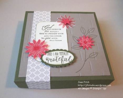
Today’s challenge is a sketch shared by my dear friend Marsha.  I’m sure it will come as no surprise to her that I had to do something just a tad different.  Instead of a card…I created a box to fill with cards.  I also took a few liberties with the sketch.  As you will see the basic sketch is present but I added an embellishment or two in the shape of extra flowers.  My theory was that flowers = pearls and sequins that others added to their cards.  What to do you think…was I stretching the envelope?  Or the sketch?   Sorry about that Miss Marsha. 😀

As you might have guessed by the title I decided to play with the Grateful Bunch Bundle that first appeared in the 2016 Occasions Catalog and whose components (punch and stamp set) are available as individual components in the new 2016-2017 Annual Catalog from Stampin’ Up!

Expressing gratitude has been much on my mind of late (note to readers…I’m very grateful for you!)

Lately I’ve been finding myself very grateful for my family doctor and the help he’s been in sorting out my chronic health problems.  After working on masculine cards for recent challenges and in anticipation of Father’s Day I’ve been in a masculine creative mood so I thought I’d create something to share my gratitude with my doctor that he and his family could make use of as needed.  After all…who couldn’t use a supply of cards right? 😀

He’s a real upbeat kind of guy who’s always positive, life affirming, big on nutrition and yoga and other forms of creative living.  One who gives as easily as he receives…or so it seems to me.   He even gets up with his little ‘uns when they have a sleepless night (now that’s my idea of a dad).  I’m hoping this  box of cards will reflect all that.

**********

 Grateful Bunch Card Box

Holds several 4-1/2″ square cards

(as always click the pictures to see larger images)

WWC70 - Marsha's Sketch Challenge - Gratitude Card Box - Jean Fitch

WWC70 - Marsha's Sketch Challenge -Gratitude Card Box Side view - Jean Fitch

And here’s one of the cards inside:

Watercooler Wednesday Challenge - WWC70 - Marsha's Sketch Challenge - card for Gratitude Card Box - Jean Fitch

As you can see I kept the card fairly simple but reflective of the box design.  Perfect don’t you think for a coworker who goes above and beyond?  One of the lovely things about a 4 1/2″ square card is that it also fits in a standard envelope.  Saves on postage if mailed.

Watercooler Wednesday Challenge - WWC70 - Marsha's Sketch Challenge - Card Box Set - Jean Fitch

Supplies:

Note:  Several of the items listed are retired as of today.  Sorry about that but at the time of creation they were still active so naturally my hands reached for the things I love!

Stamps: Grateful Bunch, Trust God (retired)

Inks:  Mossy Meadow (retired In Color), Watermelon Wonder

Paper: Mossy Meadow (retired In Color), Watermelon Wonder, Tip Top Taupe, Very Vanilla and Vellum Cardstock  & Timeless Elegance Designer Series Paper (retired).

Punches: Blossom, Corner Rounder, Large Oval (retired), Scallop Oval (retired)

Tools & Adhesives:  Big Shot, Brick Embossing Folder,  Simpy Scored, Paper Snips, Bone Folder, Tear n’ Tape, Dimensionals, Glue Dots, SNAIL.

*********

Fairly straight forward construction details.  The Simply Scored scoring tool is perfect for box construction as well as scoring cards for folding.  So many uses it’s a required tool in my studio that’s for sure.

Box was created in the same old fashioned way I outlined in this post.  Creates a 5″ square box to hold my 4-1/2″ square cards and slightly bigger envelopes.

Top: 7-1/4″ x 7-1/4″ square

Bottom: 7″ x 7″ square

Score at 1″ along all four sides for each piece.  Snip up to score line on both corners on opposite sides.  Add pieces of Tear n’ Tape to the corners and fold to the inside.  Burnish with bone folder to activate the adhesive to its strongest stick.

Once the box is completed:

Brick embossed layer – 4-3/4″ square – Stamp leaf stem image in Mossy Meadow on Tip Top Taupe then emboss using Big Shot and the Brick folder.

DSP strip: 1-1/4″ – cut at 7-1/2″ and adhered from center of box with ends cut to measure after adhered to box.

Sentiment layer: 2″ x3″ Corner rounded and stamped in Mossy Meadow with Trust God sentiment.

Scrap Vanilla: Stamp sentiment from Grateful Bunch in Mossy Meadow ink and punch with oval punch.  Sponge edges with sponge dauber and Mossy Meadow ink.   Adhere to Mossy Meadow Scallop Oval punched piece.

Flowers: Stamp flower image in Watermelon Wonder ink on Watermelon Wonder Cardstock and Vellum Cardstock.  Punch with Blossom Punch.  Adhere to box (make extra for cards!)

Hopefully the full assembly is easy to see from the pictures of the finished project.

*********

That’s it for this challenge.  To see the rest of the design teams Sketch Challenge contributions head on over to the Challenge blog website here.   That’s also where you can add your own creation with the linky doodad.  When you add your own design and there are more than three entries, one of you will be a challenge winner or runner up and have the option to place our new badges on your own site.  Of course…you’ll also win bragging rights!

Check here to see the winner of last weeks challenge.  And here to see all the other linky and Artist Team entries.  Check the challenge site for rules on competing for future challenges.

I really hope you will add your own creations this week.  Really…this challenge is an fun one.  After all the design layout is done for you.  All you have to do is grab your colors and stamps and get creating!

I hope you’ll join us next Wednesday for yet another Watercooler Wednesday Challenge.

Jean Fitch in pink


Save

Save

Save

Save

Save

Save

Watercooler Wednesday Challenge – WWC53 – Balloons Aloft

WWC53 – Heidi’s Sketch Challenge

Watercooler Wednesday Challenge - WWC53 - Heidi's Sketch Challenge - Jean's Balloons Aloft

Welcome to this weeks Watercooler Wednesday Challenge.  Today Heidi’s provided us with a wonderful sketch to work with.  I’ve actually turned it sideways so for me it looks like this:

Watercooler Wednesday Challenge WWC53- sideways

**********

Here’s my version…a tad different don’t you think?

Jean’s Balloons Aloft

Watercooler Wednesday Challenge - WWC53 - Heidi's Sketch Challenge - Jean's Balloons aloft

Instead of copying the sketch exactly I took the elements and played around with them a bit.   Are you surprised?  LOL

They are still all there (I think).  The four squares were downsized and moved apart a bit for their placement and the center panel has a mat.  I tried it plain but it just didn’t pop – a different way to say…blah.

In my imagining, as I designed, I thought of a balloon seller or a child having just let go of the balloon strings and as they drifted up the strings began to go their own way preparing to drift on the winds.  Who knows where they will drift…perhaps over your own house?  Or all the way to China from Oregon?

As for the sentiment.  Let Us Celebrate…(and eat cake) I rather thought it would work for a number of events.  Birthdays of course but also Graduation, New Baby, Anniversary and so on.  After all…what celebration doesn’t do better with cake…right?

Thanks Heidi for setting my mind drifting along with the balloons with your wonderful sketch.

Supplies:

Stamps: Balloon Celebration

Inks:  Blackberry Bliss, Hello Honey, Lost Lagoon

Paper: Whisper White, Hello Honey Cardstock.  Perfectly Artistic Designer Series Paper (Sale-a-Bration Limited Time)

Punches: Balloon Bouquet, 1″ Square, Corner Rounder

Tools & Adhesives:  Snail, Dimensionals

If you wanted to step this design up or add more texture you could use Baker’s Twine or thread of some kind as the Balloon strings, add a bit of ribbon or twine and maybe a few sequins.  I even considered adding a small word to the top of the largest balloon or possibly a small image of sentiment in a circle backed with a scalloped circle and placed at a junction of the strings.  So many possibilities that I hope you will give this a try with your own CASE of mine or your own version of the sketch challenge.

Did you notice that once again I’m playing with the retiring In Colors.  Yep…can’t get enough of them.  I hope you’ve gotten stocked up on the inks and papers and any accessories you want.  They are going to go fast once everyone realizes they are leaving…you really don’t want to be left out either do you?  Feel free to hit the Shop Now button at the top of the right sidebar and add your In Color (and other) purchase.  And don’t forget that Sale-a-Bration is still going so you can earn wonderful free products with each $50 increment you spend.

*********

That’s it for this challenge.  To see the rest of the design teams Anything Goes Challenge contributions head on over to the Challenge blog website here.   That’s also where you can add your own creation with the linky doodad.  When you add your own design and there are more than three entries, one of you will be a challenge winner or runner up and have the option to place our new badges on your own site.  Of course…you’ll also win bragging rights!

Check here to see the winner of last weeks challenge.  And here to see all the other linky and Artist Team entries.  Check the challenge site for rules on competing for future challenges.

Stay tuned to the challenge site to see who answered the Design Team Call that was issued with last weeks challenge.  I’m looking forward to new playmates in the Challenge Sandbox.

I hope you’ll join us next Wednesday for yet another Watercooler Wednesday Challenge.

Jean Fitch in pink


Watercooler Wednesday Challenge – WWC50 – Jean’s Quilt Style Paper Piecing Technique Challenge

WWC50 – Jean’s Quilt Style Paper Piecing Technique Challenge

Watercooler Wednesday Challenge WWC50 - quilt style paper piecing technique challengeWelcome to this weeks Watercooler Wednesday Challenge.   Since it’s my birthday today the rest of the artists were kind enough to let me pick the challenge and I couldn’t help looking at quilts for inspiration.   Quilts are another of my favorite fiber based crafts so I hope you’ll enjoy this weeks challenge.

It’s really pretty simple.   If you want to jump into the quilt aspect of the challenge find a pattern that looks like fun and recreate it in a paper form.  The perfect chance to dive into wonderful Designer Papers to provide your color and image patterns.  Just like visiting a fabric store and being mesmerized with color and style of pattern.  Of course you can go for the basic paper piecing too if that’s your comfort zone.  Many of our new dies make that so very simple.  The Hexagon Hivelit for example or the Rose Wonder companion die.   I saw a card the other day that had the look of a faux quilt where a sheet of Designer Series Paper was slipped behind a cut out image die.  Perfect really for a faux form of the art.   I hope you will enjoy our Watercooler Wednesday Challenge artists take on paper piecing quilt style!

**********

Here’s my version….

I’m still in a CAS (clean and simple) frame of mind so that’s what came to mind when I started putting these colors together.    To keep things simple I stuck with a single pack of paper (Pretty Petals Paper Stack) and a single traditional quilt shape punch (hexagon) and a very basic quilt pattern that many a young girl has learned over the centuries.

Hexagon Hello

Watercooler Wednesday Challenge WWC50 - Paper Piecing Quilt Technique - Exterior for Hexagon Hello - Jean Fitch

And the inside:

Watercooler Wednesday Challenge WWC50 Paper Piecing Quilt Technique Interior View - Jean Fitch

This card could easily have been called Kindred Spirits of the Heart don’t you think?   After all…friendship stitches together all shapes including hearts.

Ever since reading Anne of Green Gables I’ve been taken by the idea of “kindred spirits” and “bosom friends” and of course that meant I had to grab the First Sight stamp set first thing when the Occasions catalog products were available for purchase.   This card and the thoughts about the Anne book also reflects the feelings I have for my fellow Watercooler Artists and many of my stamping buddies.  Stamping does indeed seem to create Kindred Spirits.

Supplies:

Stamps: First Sight (2016 Occasions)

Inks:  Mint Macaron, Early Espresso & Project Life Journaling Pen & Basic Black Stampin’ Write Marker

Paper: Basic Black, Mint Macaron, Very Vanilla, Tip Top Taupe Cardstock & Pretty Petals Designer Series Paper Stack

Punches: Hexagon, Decorative Label

Tools & Adhesives:  Big Shot, Greeting Thinlits die, Heart Collection Framelit (ret.), Tombow Liquid Glue, Snail, dimensionals

The construction details are pretty basic:

The card base is square (5″ x 10″ scored and folded in half) of Mint Macaron.  Cut a Very Vanilla layer (4-3/4″ square) with corners punched with a corner punch or cut with scissors or craft knife.

Adhere your hexagon punch pieces in whatever pattern looks pleasing to you on the Very Vanilla layer and then add a faux “stitch in the ditch” look with a marker or pen.  Add your greeting (I chose a skinny die cut so the hexagons wouldn’t be covered up too much) and decorate your interior.

For this project Tombow Liquid Glue is your friend since you can brush it out to the edges and the entire hexagon will be adhered.  On note though…for winter use in areas that get cold you may have some interesting happenings when bringing your Tombow from a colder room to a warm one.  I found that the glue once started just kept coming when least expected.  Must be one of those thermodynamic things that scientists could explain much better. 😀

*********

That’s it for this challenge.  To see the rest of the design teams Quilt Style Paper Piecing Technique Challenge contributions head on over to the Challenge blog website here.   That’s also where you can add your own creation with the linky doodad.  When you add your own design and there are more than three entries, one of you will be a challenge winner or runner up and have the option to place our new badges on your own site.  Of course…you’ll also win bragging rights!

Check here to see the winner of last weeks challenge.  And here to see all the other linky and Artist Team entries.  Check the challenge site for rules on competing for future challenges.

I hope you’ll join us next Wednesday for yet another Watercooler Wednesday Challenge.

Jean Fitch in pink


Watercooler Wednesday Challenge – WWC47 – Are You Feeling the Blues? I am.

WWC47 – Marsha’s Dew Blue Color Challenge

Watercooler Wednesday Challenge - WWC47- Marsha's Dew Blue Colour Challenge

Welcome to this weeks Watercooler Wednesday Challenge.  Marsha found a wonderful set of colors on the Design-Seeds color inspiration site for us to play with this week.  I love that site.  Photography meets color with a host of possibilities.  If you are ever looking for some inspiring combos that’s one possibility in the world of the internet.  Our Dew Blue theme can be found here.

I’m still in a CAS (clean and simple) frame of mind so that’s what came to mind when I started putting these colors together.   Design-Seeds not being Stampin’ Up oriented or related I also had to interpret the colors with my own palette in mind.   I’m pretty pleased with the soft look of the finished card…almost a Hawaiian look don’t you think?  Soft grays and blues and flowers put together in what almost looks like a lei.  A few purples wouldn’t have gone amiss but alas…those weren’t included in the challenge.

So…are you feeling the blues?   I am.   {grin}

**********

Dew Blue fits Flowers

Watercooler Wednesday Challenge - WWC47 - Marsha's Dew Blue Color Challenge - Jean Fitch

Supplies:

Stamps: Petite Petals, Timeless Love, Small Script (2005 hostess retired)

Inks:  Versamark, Smoky Slate, Basic Gray, Night of Navy, Marina Mist, Pacific Point, Soft Sky,

Paper: Smoky Slate, Whisper White, Night of Navy

Punches: Petite Petal, Curvy Corner Trio, 1-3/4″ Circle

Tools & Adhesives:  Heat Tool, Silver embossing powder, Snail, dimensionals

The construction details are pretty basic.   Take a standard tent card base (4-1/4″ x 11″ scored and folded in half) of Smoky Slate.  Add a Whisper White layer (4″ x 5-1/4″) with corners punched with the Curvy Corner Trio punch.   Adhere a circle of Night of Navy (1-3/4″) with a sentiment heat embossed in silver in the center.  Stamp and punch the Petite Petals in all the shades of blue and gray inks and adhere in a circle around the Night of Navy circle using dimensionals.   Stamp a sentiment below the flower circle in Basic Gray.  Adhere the Whisper White layer with dimensionals.

Of course…this is the simple version.  I have a few ideas for an upscale version that I’ll be playing with later this week.   You can make up a few of the simple version without the sentiments and either add them inside or on the front as needed.   Originally I had intended to leave just the wreath centered on the card.   If I’d known when I started that I was going to add the Anniversary sentiment I would likely have moved the wreath just a tad higher.   That’s what we call an evolving design…with no time to redo or make substantive changes.  LOL

*********

That’s it for this challenge.  To see the rest of the design teams Dew Blue Color Challenge contributions head on over to the Challenge blog website here.   That’s also where you can add your own creation with the linky doodad.  When you add your own design and there are more than three entries, one of you will be a challenge winner or runner up and have the option to place our new badges on your own site.  Of course…you’ll also win bragging rights!

Check here to see the winner of last weeks challenge.  And here to see all the other linky and Artist Team entries.  Check the challenge site for rules on competing for future challenges.

I hope you’ll join us next Wednesday for yet another Watercooler Wednesday Challenge.

Merry Christmas and Happy Holidays to all my challenge friends and readers and I hope you’ll give all the artists and challenge winners a little comment love.  😀

Jean Fitch in pink


Watercooler Wednesday Challenge – WWC44 – Wreath for a Wedding? Yes!

WWC44 – Buffy’s Anything Goes…with Weddings

WWC44 - Watercooler Wednesday Challenge: Anything Goes...with Weddings.

Welcome to this weeks Watercooler Wednesday Challenge.  Don’t you love the title Buffy gave us.  Lovely cake too.  Yum!  When I saw the title I couldn’t help grinning as I thought about weddings I’ve attended (including my own!).  It’s true…anything goes with weddings.  I’ve seen it and lived it!

**********

Wedding Dots and Wreath

WWC44 - Watercooler Wednesday Challenge - Wedding Dots and Wreath - Jean Fitch

A little detail shot to show you the layers and levels.

Watercooler Wednesday Challenge WWC44 - Wedding dots and wreath- detail - Jean Fitch

Supplies & Measurements:

Stamps: Wondrous Wreath, Dots for Days (background stamp)

Inks: Rose Red, Versamark (you can use Whisper White Craft Ink too)

Paper: Whisper White, Rose Red, Blackberry Bliss Cardstock & Dazzling Diamonds Glimmer Paper

Punches: Itty Bitty Accents Pack – heart, 1-3/4″ Circle, Curvy Corner Trio (Holiday Catalog)

Tools & Adhesives:
Big Shot, Magnetic Platform, Wonderful Wreath  Framelits, Snail, Fine Tip Liquid Glue Pen, dimensionals

Directions and measurements:

Card base is Rose Red that is 4-1/4” wide by 11” long and folded in half.
Stamp the front with Dots for Days background stamp in Rose Red classic ink.
Punch all four corners with the Curvy Corner Trio Punch (holiday catalog).

Die cut the Joy in Whisper White (from the Wonderful Wreath Framelit collection.

Punch circle from Blackberry Bliss (1-3/4” Circle Punch)

Punch small heart (itty bitty accents punch pack) from Dazzling Diamonds Glimmer Paper

Wreath:
Stamp the wreathe image from Wondrous Wreath in Whisper White or Versamark on Rose Red cardstock. Sprinkle Whisper White embossing powder over the wet ink and heat emboss with a heat tool. Die cut with the Wreath die from Wonderful Wreath Framelit set.

Assemble:

Adhere Blackberry bliss circle to card front (hold wreath over card front to determine placement). Place the die cut wreath above it on dimensionals.
Adhere glimmer heart with a half dimensional.
Use Fine Tip Glue Pen to add glue to the back of the Joy die cut. Let sit for a minute then press down to the card front.

I left the inside blank (except for some partial wreath images in the bottom corners) so I can personalize the card for a wedding, an anniversary, engagement or other joyful occasion.  I think I could even get away with using this for a new baby, baptism or confirmation card.  After all…isn’t a wreath a symbol of life, completeness and so on.  And that tiny heart a symbol of love, grace and new beginnings?

Like a copy of the instructions?  Here you go a quick and simple PDF version.

Wedding Dots and Wreath Card Instructions

*******

I don’t know about you but I love background stamps.  Flat as the images are they still add a wonderful layer of texture for a card.   Easy too.  No dies…no extra paper…just a bit of ink and an image.   The card was pretty without the dots when I created the first version…but…the dots took it to a whole new level.

The punched curvy corners added another layer of interest (and dare I say elegance?) to the design as well.  I love that new trio punch and I love how the corners lined up perfectly when I did both the top and back levels.  I punched with a bit of trepidation but it turned out beautifully don’t you think?  Hm…I just realized I should have added another detail picture so you could see how perfectly all the edges line up.  Ah well…a thought for another post.  I’m sure I’ll be doing that corner punch thing again…and again.

And lastly.  I love that bit of glimmer in the small heart.  A perfect bit of symbolism for a wedding card.   After all a wedding is hopefully a shining beginning to a lifetime of love.  Starts small and grows from there.

**********

That’s it for this challenge.  To see the rest of the design teams Color Challenge contributions head on over to the Challenge blog website here.   That’s also where you can add your own creation with the linky doodad.  When you add your own design and there are more than three entries, one of you will be a challenge winner or runner up and have the option to place our new badges on your own site.  Of course…you’ll also win bragging rights!

Check here to see the winner of last weeks challenge.  And here to see all the other linky and Artist Team entries.  Check the challenge site for rules on competing for future challenges.

I hope you’ll join us next Wednesday for yet another Watercooler Wednesday Challenge.

Hugs and Blessings to all my challenge friends and readers.

Jean Fitch in pink


Watercooler Wednesday Challenge – WWC43 – Peaceful Paper Pieces with Kath’s Color Challenge

WWC43 – Kath’s Color Challenge

Watercooler Wednesday Challenge - WWC43 - Kath's color challenge

Welcome to this weeks Watercooler Wednesday Challenge.  Kath’s Color Challenge with a slight twist is the theme this week.   When I saw the colorful poster Kath shared on our challenge artist site I looked and thought…cool!   I love last years In Colors (and very thankful they will still be around for another few months) and happily started to plan my design.  Took me a minute to see that Kath very slyly slipped in Crushed Curry instead of Hello Honey.   Makes for a bit more pop in the color combo don’t you think?

**********

Peaceful Paper Pieces

WWC43 - Kath's Color Challenge - Peaceful Paper Pieces - Jean Fitch

Supplies & Measurements:

Stamps: Festival of Trees

Inks: Mossy Meadow, Crushed Curry

Paper: Whisper White, Tangelo Twist cardstock, Blackberry Bliss sheet from the In-Color Designer’s Paper Stack (last years design stack), Typeset Specialty Designer Series Paper.

Punches: Tree, 2″ Circle, 1-1/4″ Circle, 1/2″ Circle, Crop-a-Dile (larger circle punch on side), Itty Bitty Accents Pack (star)

Tools & Adhesives:
Big Shot,  Christmas Greetings, Metal Rimmed Pearls, Linen Thread, Snowflake Elements, Snail, Fine Tip Liquid Glue Pen

*******

I mean the title of my card literally.  I get a very peaceful feeling from all these individual pieces of paper.  I just want to hold them and then toss them on my desk to see what fun designs will emerge.   Some of my favorite bits of product and colors showed up on this card.  Most of my favorite colors, though I’m still warming up to Tangelo Twist.  My favorite images from Festival of Trees, the text type papers from the Typeset Specialty Designer Series Paper, the word peace and the die that cuts it in my new favorite neutral (black) and…ta da…my favorite accessory from the 2015 Holiday Catalog…the wood snowflake elements.  Oh…and linen thread.  As a weaver I love linen and I use that thread so very often in rag rugs and other projects that need a strong neutral thread.  Oh…and did I mention punches.  I love punches…pretty much all of them.  Quick and easy and they add lovely elements.   Okay…now that you’ve seen the list I bet you’ll have a pretty good feel for what I love most about Clean and Simple cardmaking…Everything!!

As far as the design I’ve shared above …I was cruising Pinterest the other day looking at the Stampin’ Up company collection of boards and came across a very cool collection of cards that were uploaded directly by Stampin’ Up so I suspect they were created by concept artists at the company or other company related designers.

The cards I found on the board were designed to support a special promotion going on overseas right now but since we here in North America have the same stamps (though not on sale) I was interested to see what the designers came up with.  And boy did they come up trumps.

Here’s the design I chose I found this week that immediately screamed Kath’s color challenge at me this week when my energy was running low and my mind was focused on our upcoming blog hop on Thursday (you are coming back Thursday right?).  You can check out all the concept designs for that board here.  Of course you’ll come back to me when you decide what you want to order to recreate them right?  {grin}   Those particular stamps won’t be on sale but in another few days I’ll be able to tell you what will be on sale  during our Stampin’ Up Online Extravaganza.

Don’t forget to check back!

**********

That’s it for this challenge.  To see the rest of the design teams Color Challenge contributions head on over to the Challenge blog website here.   That’s also where you can add your own creation with the linky doodad.  When you add your own design and there are more than three entries, one of you will be a challenge winner or runner up and have the option to place our new badges on your own site.  Of course…you’ll also win bragging rights!

Unfortunately we didn’t have 3 linky posts this last time so there won’t be a winner or a runner up for the last challenge.  Check the challenge site for rules on competing for future challenges.

I hope you’ll join us next Wednesday for yet another Watercooler Wednesday Challenge.

Hugs and Blessings to all my challenge friends and readers.

Jean Fitch in pink


Watercooler Wednesday Challenge – WWC39 – Six Sided Thanks My Friend

WWC39 – Susan’s Color Challenge

Watercooler Wednesday WWC39 - Susan's Color ChallengeWelcome to this weeks Watercooler Wednesday Challenge.  Colors are the star of this weeks challenge.  The lovely thing about a color challenge is that all other elements are anything goes.   Unless of course you have a thing about comfort with certain colors.  Luckily I enjoy all our Stampin’ Up colors and Susan did a lovely job of pulling out a few of her favorites.

As one of the artists for the Challenge I get a sneak peek at future challenges and even get to design a few myself.  So with my own CAS challenge coming up soon I thought I’d practice up with a clean and simple design using the required colors.  Uh yeah, hint, hint and spoiler alert!  {grin}

**********

Six Sided Thanks My Friend

WCC39 Susan's Color Challenge - Thanks My Friend - Jean Fitch

The title I gave this card makes me grin.  I just got the new Six Sided bundle that consists of stamp set and punch and it got me thinking about the six degrees of separation theory of everyone on the planet.   Of course it also gets me thinking about honeycombs and other geometric shapes in nature.  Love them!

Love that I can save 15% on bundles too…and this week only you can save 15% on any stamp set in the two current catalogs including the Six-Sided Sampler set I used if you already have the punch!   The Six-Sided Sampler set and the Hexagon punch have been around for awhile but even though they’ve a bit of history they are still fun to play with.  They sure made this weeks card fast, simple and fun.

I wasn’t sure how I felt about stamping with the Basic Gray since I thought it might bring the other lively colors down a bit but then I remembered that we have paper as well as ink in that color.  And I just got a new package of our notecards that also include the envelopes – even cooler is that the set of card and envelope costs way less than the stamp I use to mail it.   The perfect set up for a slew of thank you’s that I need to send out.   I can vary the hexagon designs since the stamp set contains 8 different hexagon images and all work with the punch.   So I can stamp a collection in each design with varying colors and then punch away while watching a movie.   Then grab my snail and start affixing hexagons to the front of notecards.  Stamp the greeting (the set comes with 3), add a die cut sentiment and then add my own note inside.  Easy Peasy.   Thanks Susan for taking the color choices out of the equation for me.  One less step to make designing easy.

Supplies & Measurements:

Stamps: Six-Sided Sampler

Inks: Pool Party, Watermelon Wonder, So Saffron

Paper: Whisper White Notecards and envelope set, Whisper White and Basic Gray cardstock

Punches: Hexagon

Tools & Adhesives:
Big Shot, Hello You Thinlit dies, Snail, Tombow Liquid Glue

**********

That’s it for this challenge.  To see the rest of the design teams Color Challenge contributions head on over to the Challenge blog website here.   That’s also where you can add your own creation with the linky doodad.  When you add your own design and there are more than three entries, one of you will be a challenge winner or runner up and have the option to place our new badges on your own site.  Of course…you’ll also win bragging rights!

We had 3 linky posts this last time so there is a winner and a runner up for the last challenge.   Check out our winners here.  And check this post out so you can see the wonderful additions by all the challenge participants. Check the challenge site for rules on competing for future challenges.

I hope you’ll join us next Wednesday for yet another Watercooler Wednesday Challenge.

Hugs and Blessings to all my challenge friends and readers.

Jean Fitch in pink


Watercooler Wednesday Challenge – WWC37 – Snowflakes of Peace

WWC37 – Jackie’s Sketch Challenge

WWC37 - Jackie Watercooler sketch Feb 2015

Welcome to this weeks Watercooler Wednesday Challenge.   As an artist on the team I always enjoy the twists and turns my fellow artists throw my way.  This week my friend Jackie provided a lovely and classic sketch.   Lovely because no matter how you put it together it’s going to look good.   Classic because well…all the shapes involved are just that…classic.   So where is the twist and turn you are asking…well…that I provided myself.   I just had to take lovely and classic and take it a slightly different way.   It is a challenge right? {grin}    Of course if you’ve been around the stamping world for a bit you’ll recognize the classic fold I used.   So really…though my design is my own and based on Jackie’s sketch…it still is classic!

**********

WWC37 - Jackie's Sketch Challenge - Peaceful Snowflake 1 - Jean Fitch

I’m in love with the new Holiday Fancy Foil Designer Vellum and in particular the sheet (3 of them) that has elegant silver snowflakes on a white vellum.   You can back it with any number of colors and it looks lovely.   I wish you could see this card in person.  The silver snowflakes printed on the vellum are really quite dark, sparkly and lovely.   In the picture above they show up closer to the real deal on the right side.

So what is the classic fold I mentioned?  I can’t remember the name but it takes advantage of the diagonal in Jackie’s sketch and opens a bit like a gatefold card to reveal the interior of the card as you can see below:

WWC37 - Snowflake Diagonal Fold 3

The flaps go down….

WWC37- snowflake diagonal fold 2

And then the center is revealed….

WWC37 - snowflake diagonal fold 4

On the inside layer I kept it simple.  On the Soft Sky cardstock I used Soft Sky ink and stamped one of the snowflakes from Flurry of Wishes all along the inside border and then placed my favorite sentiment from the entire Holiday Catalog right smack dab in the middle in Night of Navy.  I left just enough room to sign my name before sending it out.  Because really…with that sentiment…what more do you need.   Of course if you are a nonstop writer who just has a lot to say you can write on the flaps and see if your recipient can keep track too.

While the layers might look tricky on the front really it’s just a matter of creating squares for the layers and then just cutting them from corner to corner and adhering in the right order.   I’ll try to put some pictures together in another post to show you the specifics if I get a spare moment before Saturdays Christmas Stamp a Stack.

Supplies & Measurements:

Stamps:

Flurry of Wishes, Peaceful Wreath (Peace sentiment)  both from Holiday Catalog.

Inks:

Soft Sky, Night of Navy

Paper:

4″ x 12” Whisper White Cardstock – scored at 4″, 8″ and folded in thirds – then use the trimmer cut your diagonals by lining up the corner to the opposite corner of the first third of the card.  Then reverse the angle for the second diagonal on the lower third section of the three section card base.

3-1/2″ x 3-1/2” Soft Sky cardstock
3-1/2″ x 3-1/2” Holiday Fancy Foil Designer Vellum

Cut the two above layers from corner to corner and adhere together then adhere to the cut diagonals on the front of the card base.

2-1/2″ Whisper White cardstock – Circle Punch cut
2″ Soft Sky – Circle Punch cut

Dazzling Diamonds Glimmer Paper – Snow Flurry Punch cut

Silver Cording Bow (Holiday Catalog), Rhinestones

Tools & Adhesives:

2-1/2″ Circle Punch,  2″ Circle Punch, Snow Flurry Punch, Stampin’ Trimmer, Scissors
SNAIL Adhesive & glue dots

After I finished the card I realized that a similar design could be placed on the top of any square box you made to hold a gift or a gift card.   You could even place the layers without diagonal cutting on a standard 4″ square card front.  Whatever you wish…the challenge is now yours!

**********

That’s it for this challenge.  To see the rest of the design teams 3D contributions head on over to the Challenge blog website here.   That’s also where you can add your own creation with the linky doodad.  When you add your own design and there are more than three entries, one of you will be a challenge winner and have the option to place our new winner’s badge on your own site.  Of course…you’ll also win bragging rights!

We had 5 linky posts this last time so there is a winner and a runner up for the last challenge.   Check out our winner here.  And check this post out so you can see the wonderful additions by all the challenge participants. Check the challenge site for rules on competing for future challenges.

I hope you’ll join us next Wednesday for yet another Watercooler Wednesday Challenge!

Hugs and Blessings to all my challenge friends and readers.

Jean Fitch in pink