Card in the mail heralds a world record!

If you hang out in the Stampin’ Up world you’ve probably heard.  Stampin’ Up is the proud owner of a Guinness World Record that was set at our recent annual Convention in Salt Lake City.  Nice achievement to celebrate a 25th Anniversary don’t you think?

So what was the record and what does it have to do with my card in the mail?  So glad you asked…..

Guiness World Record

Did you see…most greeting cards sent  from a single location!

Guiness World Record - Most greeting cards sent from one location - it's official

And of course a nice plaque to hang in the Home Office.

Guinness World Record Plaque

So what did I get?

This!!

World Record - Hey There Friend - Deb Naylor - watermarked

My very own card from the thousands (2,984 to be exact) that were sent to set the record.  How’s that for owning a piece of Stampin’ Up history?  I love it!    My heartfelt thanks to friend and fellow demonstrator Deb Naylor for including me in this record setting convention experience.   You can read Deb’s excellent blog here.   Lots of inspiring projects and of course the latest news on Stampin’ Up products.   Stay tuned on her blog for grandkid updates.  Deb’s been visiting in my own home state of Oregon with family.  Here’s hoping her kitties forgive her though I bet they’ve been loving on the housesitter in her absence.  Cats are like that right?

Here’s the Supplies  I’ve sussed out that Deb used in her card.   It was one of her popular swap cards for convention.

Card Details:

Card dimension (folded):  3″ x 6″

Brilliant sizing as it means she got 4 card bases per sheet of Whisper White 12″ x 12″ cardstock.  And it gave her lots of room to play.  Apart from the basic layers the rest uses up scraps.

Layer sizing:

DSP: 3″ x 2″     Cardstock Mat: 2-1/4″ x 3″

Stamps: Mosaic Madness, Paper Pumpkin Welcome Kit stamp (hey there, friend)

Ink: Strawberry Slush In Color Ink Pad

Paper: Whisper White & Strawberry Slush cardstock, Quatrefancy Specialty DSP

Punches: Mosiac, Decorative Label, Extra Large Oval, Large Oval, Scalloped Oval

Other: Big Shot, Modern Mosaic Embossing Folder, Basic Jewel Rhinestones, Dimensionals and adhesive.

*****

So there you have it.   Another installment of Cards in the Mail and a little slice of Stampin’ Up history.   That’s a lot to fit in my mailbox on the highway!

Hugs and blessings to you all – may your week be sunny and filled with joy! –  Jean

Sunday’s a good day to play with Sunbursts

Sunday’s a good day to play with sunbursts don’t you agree?  Especially after days of thunderstorms and fire smoke.  Nice to have a reminder that the sun will appear again…someday.

No I’m not being existential or even grabbing for religious imagery but CASEing the catalog once again.

Check out the Annual Catalog sample on page 110.

All images © Stampin' Up! 2013-2014 Annual Catalog Page 110

All images © Stampin’ Up!
2013-2014 Annual Catalog Page 110

Makes use of the currently popular Sunburst paper piecing technique.   I’ve had several people ask me for the how to’s and the dimensions of this lovely catalog sample so thought I’d sit down and try to figure it out.   While I’m not entirely sure I’ve got it exactly right I came as close as I could with what I had on hand.  And of course I decided to give it just a tiny twist.  Always something I like to do when I’m CASEing.

Oh and in case you didn’t know.  CASE stands for Copy and Share Everything.   Something you’ll see a lot in the stamping world.  Sometimes it means an exact duplicate but for me I prefer to grab the basic idea or layout then change it up just a tiny bit to make it mine.  Besides…that allows for materials you may or may not have to be substituted.

Here’s my CASE of the catalog:

Sunburst - Catalog Case pg 110 - watermarked

Supplies:

Stamps:  Loving Thoughts, Four Frames (the flourish image)

Ink: Primrose Petals, Versamark

Paper: Primrose Petals Core’dinations Cardstock, Very Vanilla & Pool Party Cardstock, Everyday Enchantment  SAB 2012 Designer Series Paper (retired)

Other: Lucky Limeade In Color Ribbon (retired), Basic Jewel Pearls, Big Shot, Argyle Embossing Folder, Flower Trim (retired), Stampin’ Trimmer, Silver Embossing Powder

To start I watched Diane Sisnero’s lovely video on this technique.  To find more videos or tutorials check out my Techniques board on Pinterest.  I have several scattered throughout there.

Card base was cut at 4″ x 12″ and folded for a total card size of 4″ x 6″.   That catalog card looks longer to me but I can’t figure out how they would have accomplished that with materials we have in the catalog unless they cut and glued sheets together so I went with what I knew could easily be done.

I cut 10 rectangles of 1-1/2″ x 4″ and using my Stampin’ Trimmer I cut them on the diagonal to give me a total of 20 rays.    I interspersed various DSP designs from the Everyday Enchantment Collection from last years SAB papers and Pool Party cardstock that had been embossed with the Stampin’ Up Argyle embossing folder in my trusty Big Shot.   Rays were laid out and adhered all the way around a 4″ x 4″ mat of Very Vanilla.  If you have a steady hand you can add glue to the mat and then butt the rays one by one up against each other.  I recommend you play with the layout you prefer in advance.  Once the mat is filled with rays then trim the excess overhanging with your Tabletop or other guillotine cutter (scissors will do in a pinch).

Once I marked where the ray layer piece would go I stamped the finial style image from Four Frames in Versamark at a top and bottom mark and heat embossed with silver embossing powder.

The Text layer is 1″ x 4″  stamped with a text from Loving Thoughts in Primrose Petals ink and embellished with our half pearl basic jewels and a flower trim blossom that was rubbed in the Primrose Petals ink pad and centered with another half pearl.  In my CASE I added the ruffled ribbon below the sentiment piece.  Confession time…I did that mostly because I forgot to allow for the ribbon when I added the silver embossing.  Oops!   Either way…it works.

While I did have buttons and could have carried through that type of embellishment the papers I chose just seemed to call for something a bit softer.  Don’t you agree?   Besides it’s summer for a few more weeks so flowers seem the thing to enjoy before heading into fall.

If you have the Stampin’ Trimmer this project will reinforce how much you love it!   At least it did for me.  It also led me to my Simply Scored Scoring board and the diagonal plate to create the perfect sized envelope for my non standard card.

Here’s the notes for creating that from Jackie Topa’s excellent guide – remember this uses the diagonal plate for the simply scored:

4 x 6 Card Envelope

cut paper 8” square

score@3-1/8” and 4-1/2”

score one long side@ 6-3/8”

finished size 4½” x 6 ¼”

There you have it a Sunday CASE of Sunburst.   I hope you’ve had a restful weekend or if busy, then one dappled with bits of joy and ease.

If you have a minute I hope you’ll send some good thoughts and prayers the way of our very busy firefighters.   Our Douglas Complex fire nearby here in Southern Oregon was recently rated #1 in the nation with resources streaming in to fight it.  We’ve lost one young man already in the fight against fires here locally and my heart goes out to his family.   With the help of recent rains the fires are down but still going.   Means more work for those fighting and more smoke for those living nearby.    Here’s hoping your week ahead is safe, sunny and smoke and fire free.

Hugs and Sunday Blessings – Jean

Fine Friends make Fine Feathers!

Having shared my Upline  Cheryl’s card from a recent Stamp a Stack I thought I’d share another of my favorites from that same event.  My dear friend and side line Linda put together this fun card featuring Fine Feathers from the 2013-2014 Annual Catalog.   Whew…do you think I worked enough f’s into that last sentence?

All images © Stampin' Up!

All images © Stampin’ Up!

Linda’s FINE FEATHERS CARD

Stamp Sets: Fine Feathers, Teeny Tiny Wishes

Card Stock: Crumb Cake (8-1/2” x 5-1/2” card base), Midnight Muse (1-1/2” x 5-1/2”, 2-1/2” square for buttons, scraps for punch)

Ink: Midnight Muse

Accessories: Dotted Scallop Ribbon Border, Sweet Buttons Embosslits, Piercing Mat, Piercing Tool, Word Window Punch, Modern Label Punch, Linen Thread, Simply Scored, Bone Folder, Big Shot

Here’s the instructions if you would like them:

FINE FEATHERS CARD – Linda Miller

*****

Beautiful card don’t you think.  Perfect for the guys or gals on your list.   The details on the feather images are beautiful and quite realistic.  I’ve matched one or two of them to feathers found outside my mountain valley home.

Thanks Linda for sharing your talents today.

Hugs and blessings to you all – Jean

Bermuda Bay is back and just as beautiful the second time around.

When Bermuda Bay was first introduced as a new in color it took me awhile to warm up to it.   Now in the interval it was gone I’ve fallen in love with Pool Party and other greeny blue type colors and wished Bermuda Bay was back so it could play with newer colors..   Request approved!    Now Bermuda Bay is back and beautiful in my adapted eyes.   Funny how sometimes we have to miss a color to appreciate it when it’s back don’t you think?   And now it’s back with friends in it’s color spectrum.   Have you seen it layered with Coastal Cabana and Pool Party…gorgeous.

Today to celebrate I thought I’d show a card my upline Cheryl shared at a recent Stamp a Stack.   One can never have too much Bermuda Bay right?  A calm ocean of color just waiting for someone to dive in and swim.

Coastal Cabana Punch Card

All images © Stampin’ Up!

Supplies:

Stamps: Label Love, Fabulous Phrases

Ink: Bermuda Bay

Paper:  Bermuda Bay Textured Cardstock (no longer available but we have something similar now in the Core’dinations paper), Bermuda Bay Cardstock, Naturals White Cardstock, Silver Glimmer Paper.

Punches: Artisan Label, Small Heart, Decorative Label, 1″ Circle

Other: Big Shot, Top Note Bigz die, dimensionals & snail adhesive

*****

Gotta love all that monochromatic layering.  A little stamping, a little punching and quick pass through the Big Shot and you have lovely Bermuda Bay goodness to send on its way.   Wish you could see this in person as the colors and papers glow and sparkle.  Makes me want to take a trip to Bermuda!

Something else this card does is highlight one of the deals in the New Annual Catalog.  A bundle with bundle pricing.   Save 15% when you purchase the Artisan Label punch and the Label Love stamp set in their bundle configuration.

Want to save even more?  Click and download the lists of bundles found throughout the Annual Catalog and the new Holiday Catalog just released last week.  If you are a demonstrator reading this, feel free to borrow and distribute these flyers to your own customers.

Bundled Product Flyer PDF of bundles with pictures and ordering information

2013 Holiday Catalog Bundles Flyer – PDF of Holiday Catalog Bundles

Hugs and happy stamping – Jean

If you’ve got the pumpkin…I’ve got the dress!

I know, I know….I’m a couple months early for real pumpkins…and I’m not exactly a Fairly Godmother but….with Stampin’ Up’s help this month you may think I am.

There is another kind of pumpkin that will drop this stamp right on your doorstep (along with a couple of others) read on for a special not to be missed deal.

All images © Stampin' Up!

All images © Stampin’ Up!

Perfect for an August Summer Ball right?   Or something to create and send to a friend.

Supplies:

Stamps:  Hey Friend ( Paper Pumpkin Welcome Kit Stamp)

Ink: Early Espresso

Paper: Pool Party, Crumb Cake, Whisper White

Punches:  Extra Large Oval Punch, Itty Bitty Punch Pack

Other: Big Shot, Scallop Circle Bigz die,  Manhattan Flower Folder (retired), Perfect Polka Dots Folder, Pool Party Seam Binding, Rhinestone Jewels, Craft Scissors  (long bladed), Dimensionals.

After showing friends how the new dress framelits work a few started asking…if we don’t have the framelit just yet (and yeah…why don’t you. LOL) isn’t there something else cool I can use to make a dress with…something I might already have?   Well yes…there is.  If you have a Big Shot and Scallop Circle die (or if you don’t mind petite – a scallop circle punch will work just fine) here’s a quick and fun summer frock.  And you know I’ll hook you up with a tutorial for the template right?   As with many designs that have been floating around for years this is a CASE of a CASE of a CASE and on back down the line and I wouldn’t be surprised if you saw something similar elsewhere – I found my inspiration here (Thanks Jen!) and did an almost total lift except for the text stamp and the little flower accent.   Since it’s August and Pool Party weather…what other color would you expect to see for this Cinderella number.   Embossed Polka Dots add to the festive air and the retired Manhattan Flower folder adds that summer floral touch.   What more could a soon to be princess ask right?  Well…a deal on the makings would be nice so read a little further.

Here’s the PDF directions for the card:

Scallop Circle Manhattan Flower Dress Card – Blog

*****

Here’s the venue to get the stamp I used.  Sign up before August 31st and remember to use the promotion code and the entire kit including shipping will only cost you $10!   Not bad for a block, a spot, stamps and the makings for 4 cards!   That’s cheaper than a class!

Check it out!

Click on the picture to be whisked away to my sign up site.  And don't for get to add the magic word pumpkindeal

Click on the word here below to be whisked away to my sign up site. And don’t for get to add the magic word pumpkindeal

Offer Dates: July 18, 2013 -August 31, 2013

Offer Details: Use the promotion code PUMPKINDEAL to join Paper Pumpkin before August 31, 2013, and pay only $10 a month* for the first two months. *plus tax, where applicable. Shipping included!

The Fine Print:

  • For new subscribers only.  (If you’ve subscribed before and quit  just use a new to the pumpkin email address as your contact/account key and you’re in)
  • Promotion applies only to the first two months of a new subscription. After receiving two month’s worth, the price for each month’s kit will go to the regular price: $19.95.
  • You  need to click here to join.
  • You must click “Add Promo Code” and then enter the promo code PUMPKINDEAL in the “Promo Code” field when you sign up on the mypaperpumpkin.com website to take advantage of this promotion.
  • You must join by Saturday, August 31, 2013; 11:50 PM (MT).

More info you need to know.  If you sign up after the 10th of August your first kit will arrive the mid to end of September and then the second $10 kit will arrive in October.  October’s kit will be the same as anyone else in the program gets.  In September (or August if you get on the ball and order today or by the 10th) you’ll receive the following “Welcome Kit” for your first Pumpkin experience.

Paper Pumpkin Welcome Kit

Welcome Kit
All images © Stampin’ Up!

Now that you’ve seen the card and heard about the fabulous deal why aren’t you dancing?   Hee, hee.   Deals always make me do the happy dance.  How about you?

happydance

Click the empty box to see the dance.

Okay…so that may not win me my Prince…but a girl can dream right?  And take dance lessons.  😀

Hugs and happy hazy days of summer from your Paper Pumpkin Godmother wanna be.  – Jean

Where are your borders… and everything but the colors are current…Floral Fusion love #2

Psst:  Have you heard…the 2013 Holiday Catalog went live last Thursday!  Make sure to download a copy and enjoy!

And don’t forget the carryover Holiday product found here!

Now back to our regularly scheduled post. {grin}

*****

What’s a girl to do when she has no graduation stamps?  Improvise of course!

Well that and check old SU catalogs for CASE inspiration and then head for the border with a guide to Fabulous Phrases.

Here’s what I found for my favorite stand by text stamp set – Fabulous Phrases – in last years catalog (not really all that old right?):

Fabulous Phrases - SU Card

All images © Stampin’ Up!

And here’s where I ended up:

A tiny tad tricky since I wanted one layout to work for guys and gals.  So Floral Fusion Sizzlit to the rescue!   Lets me use more guy type colors and soften it with a floral flourish right?  And bling…can’t forget the bling for the girls.  And curves…definitely need a few curves (did I mention I’m working slightly blue today…Bashful Blue to be exact…seemed appropriate).

Borders Score - Celebrate You in Crumb Cake

In case you are wondering…it’s supposed to be read Celebrate You, Celebrate Life, Celebrate Dreams.   I know…I shouldn’t have to explain but when I did this card at a Stamp Camp it turned out to be necessary.  Campers thought I left off the r on the you.   What do you think…should I send instructions with the card?   Sad when you don’t know if a graduate can read (or at least read the way I intend them too) don’t you think? 😀

Borders Score Celebrate You in White

And here’s the more masculine version:

Borders Score Masculine

I should probably mention too that this card is a great layout for using up scraps and leftover die cuts and punches from other projects.  If you are like me you have a box filled with punch cuts from those scraps you just don’t want to throw away with out taking tiny punches to them.  One other note about this use of the Floral Fusion.  I used the two smaller sizes on the die and added in the Itty Bitty punch pack matching punch so my flowers would be smaller than the one on the CASE of Carrie’s card here.

Supplies:

Stamps: Fabulous Phrases, Suggestions for interior: Pure Gumption, Word Play, Pursuit of Happiness

Ink: Bravo Burgundy, Early Espresso, Soft Suede

Paper: Bravo Burgundy (4”x11”), Bashful Blue (2-1/4”x 3-3/4”), Certainly Celery (3-1/2” x 1-3/4”  & 3-1/2” x 1-1/4”), Whisper White (3-1/4” x 1-1/2”)

Punches: Itty Bitty Shapes Punch Pack

Other: Simply Scored, Borders Scoring Plate, Jewels Basics Rhinestones, 3/8” Whisper White Or Crumb Cake ribbon, Big Shot, Square Lattice Embossing Folder, Flower Fusion Sizzlit, Apothecary Accent Framelit, Label Framelit.

Gotta love that Floral Fusion die.  Simple shape that layered really stands out.  And…it coordinates with the little punch from the Itty Bitty Punch Pack so nicely.   Classic shape I used to come across quite a bit in my Art History classes too.  For the masculine version I made use of the basic shape and skipped the floral frou frou.  Although now that I think about it…I think I did intend to put one rhinestone jewel on the Bashful Blue itty bitty punch piece.  Sigh…the best laid plans right?

And did you notice the embossed designs on the Bashful Blue larger layer piece?  Nope not a new folder or a new use for an old one.   It’s the Simply Scored Borders Scoring Plate!  How’s that for a mouthful.   I love the extended use that plate gives me for my favorite Stampin’ Up tool.   Well…favorite next to my Big Shot that is.  And that’s exactly where that Simply Scored tool is…right next to my Big Shot on my beat up German dresser I found when thrifting several years ago.  A small adult could almost sleep in the drawers that’s how big it is.  Makes for a nice work surface.

If you haven’t used the Borders Scoring Plate here are a couple of videos with tips and details on it’s use.  My favorite is Kay Kalthoff’s but Donna Griffith of Stampin’ Up does a nice job with the basics as well.

http://youtu.be/4nmomT1p_VQ – Stampin’ Up video

http://pinterest.com/pin/464644886525614204/– Excellent tips for success by Kay Kalthoff (if you only watch one…watch this one!).

If you’d like the extended details and directions here they are.  Feel free to mix up the colors to match your school or your stash or next Stampin’ up paper order.

Borders Celebrate You – Graduation – blog version – PDF Directions

And here’s a fun game I came up with for this stamp set a couple of years ago.  Yeah…I have way too much time on my hands.  LOL.

Fabulous Phrases game sheet

And my answers are here:

Fabulous Phrases Word List

Hope you had a day filled with fun and stamping.

Hugs and Blessings – Jean

Window frames on your artwork give dimension to your world

I think I’m obsessed with windows lately.   Both the kind in my house and the one’s on my cards.    The real windows are sealed shut against the smoke from area fires…so of course I want to open them….badly!   My brain keeps thinking fresh air is on the other side of the glass even though my eyes tell me there is only heat and smoke.   I guess my old Sandycat and I have something in common.  When she was alive she was always wanting on the opposite side of the door or window in front of her.   I guess I really do have cat DNA like my friends like to say.   Now if only I had a few of their other attributes than lack of patience….sigh.

As I was flipping through some of my cards looking to send a few rays of joy outside the smoke zone, I came across a few of my favorite Window cards I’ve never shared.  As you can see I’ve been using up my stacks of retired designer series papers and ribbons but of course the design works in whatever colors you have on hand or are planning on purchasing.   This same design in Gumball Green or even the lighter Pistachio Pudding would work equally well.

Label 3D Frame - Apothecary Art - Lucky Limeade - watermarked

Supplies:

Stamps: Apothecary Art, Loving Thoughts

Ink: Lucky Limeade, markers in your favorite pinks and reds

Paper: Lucky Limeade, Naturals Ivory Cardstock, Champagne Glimmer Paper, 2011- 2013 In Color Designer Series Paper stack (the set that retired in May)

Other: Big Shot, Labels Framelits, Tombow multi purpose glue, stampin’ dimensionals, glue dots – Sale-a-Bration 2012 ribbon

*****

Ever since Stampin’ Up released the shape based Framelit dies I’ve been hooked on creating frames and layered windows for cards.  Hooked too on the great deal of getting multiple sizes of the shape for one low price.    The new Magnetic Platform makes their use even easier than ever before.   Sadly that lovely tool is so popular that the supplier can’t keep up!   Stampin’ Up has assured us though that it should be back once again in early Fall.   Stampin’ Up could have kept the platform in back order status and continued to accept orders, but they just didn’t feel good about sitting on people’s money for extended periods without getting them their platform so they have temporarily turned that order number off.      Keep your eye open for it’s return in a few short weeks though…okay?   You really do want the Stampin’ Up one.   After all…you get me along with the platform right?  {grin}  And the great Stampin’ Up service and warranty guarantees that are so much easier to work with.

Back to the window frames…it really is easy.   I found this excellent video on YouTube that shows the process really well.

When you are done watching that come on back and take a look at a few other versions I created last St. Patrick’s Day.    Then give the technique a try for yourself.   It’s really very, very easy.   And addicting!

TIP: One tip I’ll pass along that I discovered.   Keep a sample frame of the smallest and largest on hand to use as a frame for your stamping so you get a feel for what and where you need to place your image.   Use the larger frame to center your stamping area and the smaller to see the overall size of image you are shooting for.    You can also put your frames through an embossing folder for a different kind of framed look.

TIP: And another tip.  If you have coordinating stamp sets for your Framelit dies they make an excellent choice for filling the windows.   I’m so grateful to Stampin’ Up for carrying over the lovely Apothecary Art stamp set to our newest annual catalog.   I love working with this shape and those images are elegant and vintage to boot.

SNEAK PEEK:   If you too love the label shape take a look at the new Thinlit Card dies that Stampin’ Up is making available for sale starting August 1.

Thinlit Card Die Flyer

Create your own flip cards in a single pass and check out all the accessory dies that come with the basic moving card die.  Whoo Hoo!  Stampin’ Up! does it again!

*****

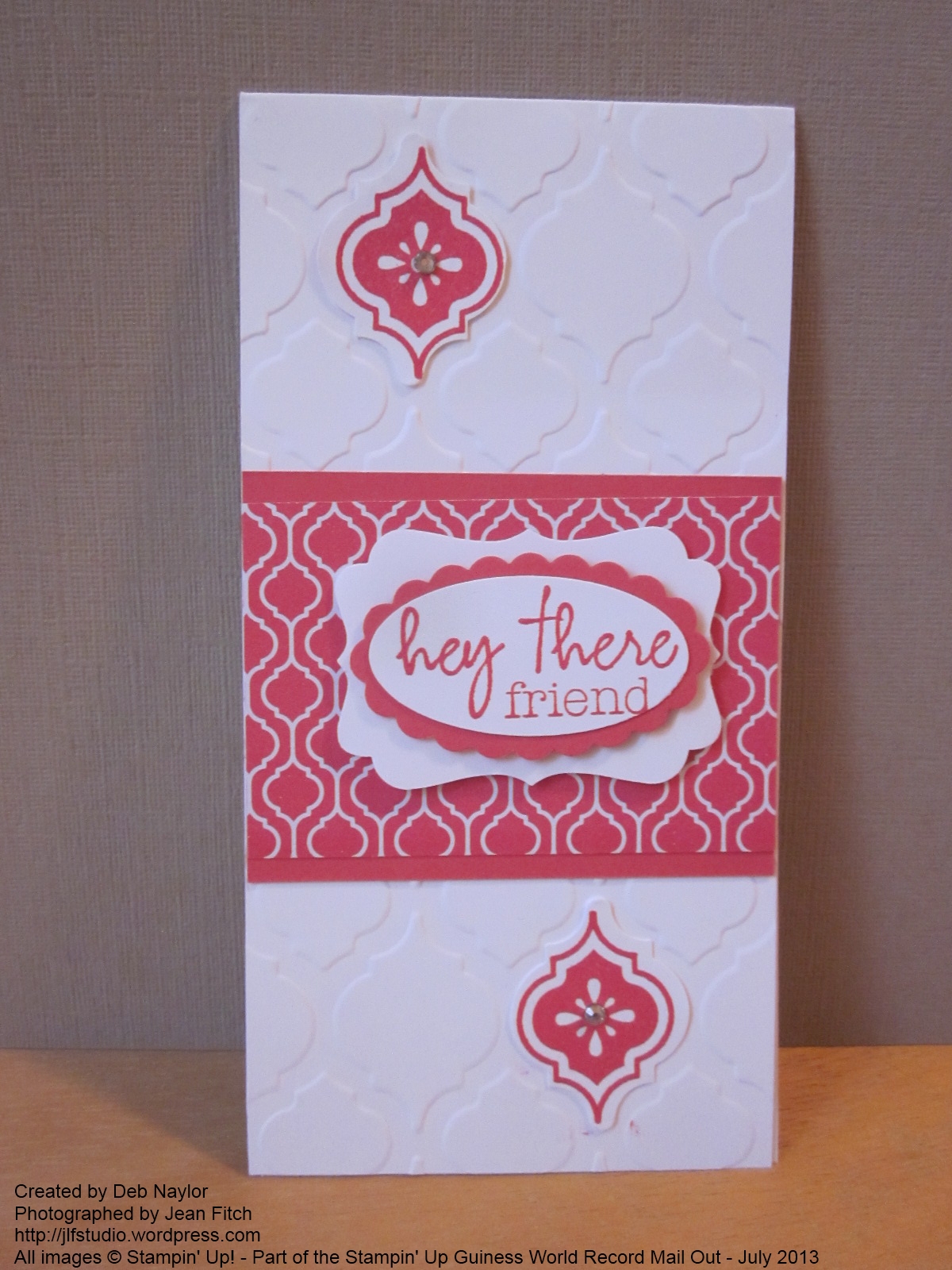
Here are the St. Patrick’s Day versions – easily adapted to hearts or other images for othe celebrations.   Wouldn’t a Bird Punch image look lovely in place of the shamrock in the first card?

Label Window - Trust God Shamrock

All images © Stampin’ Up!

Label Window Card - Twin Shamrocks

All images © Stampin’ Up!

Label Window - dual shamrock

All images © Stampin’ Up!

St. Pats card inside

All images © Stampin’ Up!

Supplies:

Stamps: Trust God, Teeny Tiny Wishes, Occasions Alphabet, various retired sentiments

Ink: Lucky Limeade

Paper: Lucky Limeade, Basic Black, Naturals Ivory Cardstock, Champagne Glimmer Paper, 2011- 2013 In Color Designer Series Paper stack (the set retiring in May)

Punches: Itty Bitty Punch Pack, Small Heart, Bird Builder, Wide Oval, Word Window, Scallop Circle (1-3/4”)

Other: Big Shot, Labels Framelits, Tombow multi purpose glue, stampin’ dimensionals, glue dots, Sale-a-Bration 2012 ribbon.

And the directions in case you would like them:

Shamrock Layered Frame card – with pictures  – PDF of directions


Here’s hoping your windows are showing something more lovely than fire smoke.   And that you can breath deep and stamp some fun windows on your world.

Hugs and blessings – Jean

In Colors are…well…in…right?

More smoke filling the skies today so it seemed like a good day to share a smoky card.    Here’s a design that you can see in a slightly different format in a Stampin’ Up video celebrating our latest Color Refresh.

My Upline Cheryl (Hi Sweetie!) and I worked out the directions and a CASE of the basic design when we shared this in May at our Stamp Camp we held with our partner Linda.

Here’s ours in Smoky Slate (paper and ink):

In Color with Smoky Slate - watermarked

Hard to tell from the lighting but these are the 2012-2014 In Colors.

Supplies:

Stamps:  Loving Thoughts , Distressed Dots (retired background stamp)

Papers: Summer Starfruit, Gumball Green, Midnight Muse, Raspberry Ripple, Primrose Petals, Smoky Slate (new neutral color this year), Whisper White

Inks: Basic Gray, Smoky Slate

Other: Big Shot, Large Scallop Edgelit, Floral Fusion Sizzlit, Itty Bitty Punch Pack, Basic Jewel Pearls, adhesives

And here’s a screen shot of Carrie Cudney’s original version:

Color Refresh - Soft Subtles - Carries Card

As you can see she went with a Crumb Cake/Very Vanilla scheme and the Stamp Set – Sassy Salutations

To see all of her variations (I showed the Subtles version) you can watch her Color Renovation video here.

Here’s the directions with pictures of all 4 of Carries variations:

Carrie Cudney’s Color Refresh Card – PDF of directions

When you have a Big Shot these cards are simple and quick.  Nicest thing about them…the two dies are two of our least expensive.   Lots of flower power from Flower Fusion Sizzlits at $5.50 don’t you agree?   And a great way to use up scraps you weren’t sure what to do with.  Another CASE possibility is the Scallop Edge border punch too.

Bring some color into your life with Stampin’ Up’s color collection.   Perfect way to brighten up a smoky day right?

Hugs and thanks for your notes of concern.   I’m praying hard for those in the direct path of the fire and for those fighting it.  I hope you’ll join me.

Bless you – Jean